Musings on: is ‘over-saturation’ a reasonable and fair term?
I’d like to answer the question in the title with a simple ‘yes’ or ‘no’, but I can’t: as in so many things, context is everything.
Similarly, if I could just say “I’m ambivalent”, that would be a pleasingly simple answer too. Fortunately, from the point of view of this article, I can’t say that either. Having thought about this for a few days, I now have a fairly clear set of views on the whole ‘over-saturated’ debate which seems to rage across the sharing sites perpetually: that’s the subject of this post.
Why this musing?
A few days ago, I had never given the question of colour saturation more than cursory consideration; I was prompted to do so by comments on my recent Flickr post, ‘Olstind dawn’. Unlike the majority of my images, it’s not exactly muted in its colour palette. As it happens it is desaturated, but it’s still very much on the colourful end of the scale by most standards! As the comments came in, I posted a link to a ‘before’ version of the image and that produced a split between those viewers who preferred the bright, ‘as it was’ version and those who thought my more muted one was better.
To me, the version I uploaded to Flickr still looks unrealistically colourful, even though I know that the real colours were even more wildly outlandish. I think I chose to subdue the colour because I liked it that way, but I’ll admit that there may have been an undercurrent of “this is ridiculous; no-one will believe it” in there too! Having then done a search for the word ‘saturation’ on this blog, I found that I’d only used it twice: once to say that a particular image, ‘Charcoal sunset’, had been boosted slightly; once in an article on the learning benefits of making ‘not-so-good’ images. So, given what a prominent topic the excessive use of the saturation sliders can be, I thought I’d put a few thoughts together.
This actually started off as one article, but it’s such a big topic that I’ve split it into two short pieces, the second of which I’ll publish in a week or so. This one deals with whether manipulating saturation can be seen as ‘right’ or ‘wrong’; the second will consider why it might be that we have, collectively, certain preferences, and how those preferences might be applied. I should point out that all of this is entirely opinion; there really is no definitive answer to the question, merely my contribution to the debate!
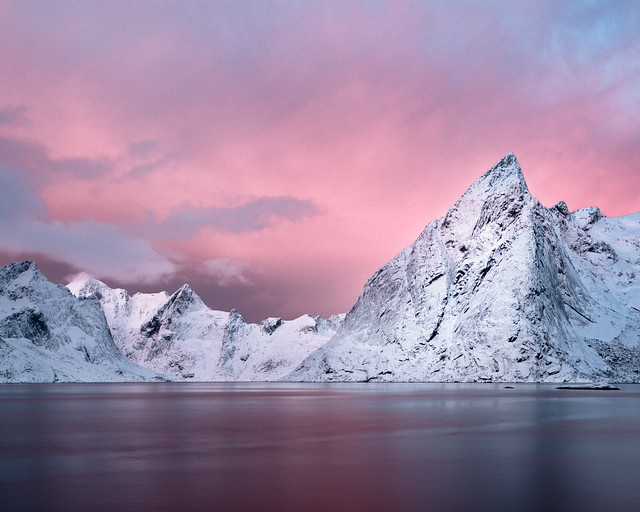
This is my desaturated version of ‘Olstind dawn’.
So what is the context?
I should point out that I am emphatically restricting this to a discussion of colour saturation in landscape images; this is a complex enough debate to contextualise as it is, without introducing even more variables, and I don’t think anyone would want to read the several thousand words of caveats I’d require in order to expand beyond the landscape genre ;-)
So, within that ‘landscape images’ context, what more is needed to answer the question?
Essentially: intent.
Intent is critical; it defines the objective the photographer has in creating the image. To take that a step further, it’s really expressed or stated intent. There are three broad categories to consider, as follows.
- ”This is how it was”. From my perspective, if I claim that my image represents a true capture of reality, then I am obliged to make the colours as real / genuine / authentic – pick your word! – as possible. More than that, I think I should also qualify the statement by adding “…as close as I can make it”, or some such acknowledgement of the failings of human memory, the visual system, and photographic method. The key point is that it should be made clear to the viewer that what they’re seeing is definitely intended to represent, accurately and truthfully what was there at the time. I never do this myself, nor remotely intend to.
- “This is how it looked to me”. This is the murky middle ground and I think it’s an abrogation of responsibility. That particular statement, and similar, has an implication of “that’s how it was” even if, taken literally, it doesn’t quite say that. For example, it doesn’t explicitly acknowledge that I might have been in an especially positive mood, seen vibrant colours everywhere and hence processed the image to reflect that mood, pumping up the saturation to suit. It definitely requires qualification to the point where it becomes a completely new statement. Usually, whether consciously or not, descriptions of this sort conceal all sorts of post-processing manipulations which are rarely made ‘public’. (And I include in that using the ‘vivid’ setting on the camera and treating the result as ‘how it looked’.) To me, this type of statement is the problem which causes so much debate. Anything falling into this category should be qualified and moved to one of the other two! Needless to say, I don’t do this either.
- ”This is my interpretation of how it looked”, or ”this shows how I felt about the subject”. These seem like perfectly reasonable statements; they’re inarguable. They make no claim to reality or authenticity; they acknowledge that I’ve used the landscape as part of the input to creating a final image, but that what the final image contains is a composite of the original subject and my artistic interpretation; an amalgam of emotional context, pre-visualisation and intent. This summarises my personal intent in every image I make: no claims whatsoever of authenticity :-)
Much of the contention around ‘over-saturation’ stems from people using variations of the second statement or, less commonly I hope, claiming the first whilst delivering something which clearly isn’t an authentic representation of the original scene. i.e. photographers are exaggerating the colourfulness of their subject, either deliberately or since they don’t recognise that they’re doing so. The simple fact is that it should only matter that an image features increased, or indeed decreased, saturation, compared to the original scene, if the photographer simultaneously claims that it is a truthful representation of reality.
‘Be honest’, in other words!
Unless misrepresented as ‘a true record’, any given image is simply artistic interpretation. There’s nothing wrong with saying ”I made this bright and colourful since I like the look of it that way” – it’s simply a matter of preference. Yes, I’m sure no-one reading this would inappropriately misrepresent something as ‘reality’, but it is very easy – I’ve certainly done it – to criticise something for being hyper-real without first determining the creator’s intent.
Is modifying saturation intrinsically either good or bad?
If the photographer’s intent is clearly stated as one of representing reality then it’s obvious that saturation should only be changed in order to achieve that. Simple. End of story. The job is to show real colours, and anything which deviates is unequivocally wrong. This is the first instance above and we can still, of course, debate how good a job they’ve done.
Ignoring deliberate deception – pumping up the colours and claiming that they’re real – that leaves changes in colour saturation which knowingly move the final image away from pure representation. It seems to me that this can only be judged in terms of results, and those results are so tied up with artistic intent that there simply isn’t an answer. I can look at a particular image and say that it’s too saturated for my liking, but I can’t remotely claim that as an absolute. If the photographer has a target audience in mind and that audience is known to rave about saturated colours, it’s reasonable to assume that boosting colours will be popular – there’s nothing wrong with that.
Another facet is that it’s currently fashionable to admire muted colours; images displaying a desaturated look are perhaps more likely to be described as ‘art’, purely as a result of that desaturated appearance. Fine. This, too, is neither wrong nor right, it’s simply an observation of current preferences. It may even be a backlash against the trend for bright, saturated colour which could itself be argued to have begun – in photographic terms – with the advent of colourful films such as Fuji Velvia and which has since continued with the appearance of post-processing sliders in the digital age.
It’s also possible that, since many ‘old master’ paintings are relatively dull, we automatically associate ‘muted’ with ‘fine art’. Yet when they were originally painted, many of these paintings were truly vibrant; they’ve just aged and faded! Centuries old paintings which have been ‘aggressively restored’ can sometimes be considered to be positively garish! (At least, they can by me and I’ve heard that comment from more than one other person…)
Possibly the really tricky area is in images which stray just slightly from reality. It’s easy to say that something is too colourful, or too lacking colour, when it’s obviously far from the original scene; when it’s close, but not quite right, then it becomes tricky – much in the same way that images which are nearly, but not quite, square tend to jar somewhat with lots of people. Perhaps avoiding ‘nearly-but-not-quite-right’ is the way to go? Joe Cornish often talks about the end result of post-processing being ‘credible’: that seems to be an excellent criterion for judgement. And if it’s incredible, then make it clearly so.
So, where does that get us?
The only thing that I can conclude so far is that ‘anything goes’, provided it’s not represented by the photographer as ‘true to life’, or whatever the chosen phrase is. So I shall end this article with an admonition to please consider the motivation and intent of an image before declaring it to be ‘over-saturated’ – I’m certainly going to attempt to do that. That’s not to say that ‘over-saturated’ is an invalid criticism, but it’s not an especially reasonable one without first exploring the context. Further, if we do declare an image to be ‘over-saturated’, it should always be qualified with ‘…for my taste’!
The next step?
Returning to my earlier comment on the much-used and insufficiently precise ”this is how it looked to me” idea, I personally think that many images posted on photo-sharing sites and described as ‘true colours’ could fairly be described as very over-saturated for my taste! And, irrespective of their veracity, I do seem to prefer muted colours in general; not to the exclusion of vibrancy and saturation – they have their place – but I certainly prefer the ‘dull’ end of the scale, at least when restricting the view to landscape photographs.
So, the question for the second part of this musing is that of why some people prefer restrained colour palettes over joyous, vibrant ones, and vice versa.
And finally, this version of ‘Olstind dawn’ is what I believe I saw….

Thanks to Robert Garrigus for specifically suggesting this musing.

5 Responses to “Musings on: is ‘over-saturation’ a reasonable and fair term?”
[…] Post navigation ← Previous […]
I can undertand the debate and the dilemma intellectually, but to use the old cliche” at the end of the day” does it really matter. Who knows how diferent people see colours and saturation – our eyes and brains ( we see with the brain ) are all different and we may stand next to each other viewing the same scene, waxing lyrical about how great the coloirs are, yet be seeing quite different tones and hues if we could plug ina flash drive to our brains and swap them ! To me photography, and that includes landscape photography is as much an art and an interpretation that if an image looks attractive , maybe that is enough. Of couse a completely oversaturated image will look awful and we will all recognise that, or those of use looking for “realisitic representation” will, but when it come to subtle changes, then I do no tthink we can judge beyond whether we like it or not. We probably all have images that look “oversaturated” but to us are how we saw it and so should we artifcially desat ? A bordeaux is more heavily saturated than a pinot noir, but they both taste good !
Thanks for commenting, Tim. I won’t argue too much on the ‘does it matter’ thing ;-) As you say, perception of colour is undoubtedly different between people and we certainly can’t assume that we’re seeing the same thing. Essentially I agree: if an image looks attractive that’s fine in itself, but I do think that awareness of the effect of saturation changes is worth having. i.e. the point I made that reducing it tends to emphasise shape and form over colour (irrespective, I imagine, of the viewer’s absolute perception of colour). That fact – knowing the effect of a change in terms of the overall balance of the image, is valuable I think, whether it’s employed or not. As you say, subtle changes – and mine mostly are – may not change the image radically, but they will possibly change what is noticed in the image when people view it, subconsciously rather than consciously in all probability. Knowing that seems to me useful.
So, yes, that’s a perfectly fair comment on the article. Part of why I write these essays is to record what I’m thinking about with respect to landscape photography though, and musing on these things, regardless of whether the conclusions are absolute or whether my view changes over time, is itself – at least to me! – an interesting exercise. Plus, it promotes debate and differing views, just like this, which is helpful to me in developing further I think… So, thanks very much for that :-)
Sorry for rubbish grammar and typos !
No worries – thanks for your time in thinking about it.