mikegreenimages

Mike Green's thoughts on landscape photography

Posts from the ‘Photography’ category

Top category showing everything I’ve written directly related to photography.

A paean to printed portfolios

Don’t worry, there’s no danger of this being literally a paean, at least not in the sung or poetic sense; I just liked the alliteration and it’s really not too strong a word for the enthusiasm I feel in encouraging you to make a physical portfolio of your images. That is: actual, printed photographs bound in some kind of case or book, not a folder on the web or on your computer! I did so a few months ago and I’m very pleased with my investment of time and money.

If you already print things, and you’ve already made yourself a portfolio, you almost certainly won’t need convincing of the benefits of doing so, both the obvious ones and those which maybe weren’t apparent until you’d made it, but, importantly, I’m not writing about printing in general here; this is specifically advocating the idea of making a collection of prints as a portfolio, as a thing in its own right. If you haven’t yet done so, please read on …

Portfolio 2

Upsides

No matter how much I tell myself, and believe, that artefacts which exist digitally are just as ‘real’ as, say, a piece of sculpture, or a book, they’re real in a different way. Yes, they most certainly exist – my electronic portfolio exists every bit as much as my newly created, paper-based one – but they’re intangible. A printed portfolio is tactile; it has substance in a human frame of reference, not [questionable] substance in the form of whatever digital medium an image is stored on, only accessible via computer rendering.

No matter which particular form of words you’re happy with in differentiating types of ‘real’, prints are less ephemeral than screen-renderings and they’re accessible with more human senses. Prints in a portfolio add touch, sound, and possibly smell (!) to the singular sight available on a screen. Prints provide a far more involving form of ‘real’ than viewing images on a computer.

That’s not merely good for you, as the creator of the printed portfolio, it’s good for people to whom you show it. They too benefit from the enhanced sensory experience of perusing a set of physical prints in some form of presentation case or binder, rather than swiping a screen or clicking a keyboard (though the inclination towards excessive caution when handling the portfolio – at least in my case – may reduce the tactile aspect somewhat, as I’ll expand upon below!).

I should say here that an easy way to produce portfolios is to use transparent sleeves held into a binder, into which the prints can be inserted. Full marks to that option for flexibility and nominal ease of use, but it places a plastic barrier between the print and the viewer. To me, that removes several of the benefits and comes close to a compromise too far. I’d almost rather use a screen than peer through plastic, and if the intention is to remove the prints for viewing then regular replacement might well be in order too, not to mention that the whole viewing process is inevitably fiddly. Better to have a set of prints in a nice box, perhaps, removing those issues and giving ‘full access’ to the work?

That ‘nice box’ idea leads onto another benefit: the printed portfolio itself can be an attractive, even artistic object. This particular, perceived characteristic is made very clear indeed by the remarkably widespread availability of presentation cases into which tablets can be placed or attached, specifically for use as a photographic portfolio. There’s no real, functional benefit at all in handing someone a tablet in a wooden / leather / aluminium / whatever binder on which to view your portfolio, but it feels nicer – and, again, like a better form of ‘real’ – than just handing over a tablet ‘naked’.

That said, actual printed images in a binder or box are still better. Presenting a collection of images as an artefact in its own right gives the opportunity for additional creativity in the design of the object itself; it makes the individual works into ‘something more than the sum of the parts’. Oddly enough, a computer-based folder or web page doesn’t seem to have quite the same effect ;-)

Portfolio 3All of the above leads, or at least did for me, to a surprising feeling of progress in my work which I’d utterly failed to anticipate. Irrespective of the level of merit my printed portfolio and the images in it represent, the process of designing and constructing it was involving, required a fair bit of thought, and was ultimately very rewarding; far more so than I’d expected. Producing the object was very emotionally engaging and it made me feel that I’d moved on with my photography. No matter how many images you store on a hard drive, and how nicely they’re organised, the feeling of “I made this” is much more satisfying and convincing with the physical object!

Downsides

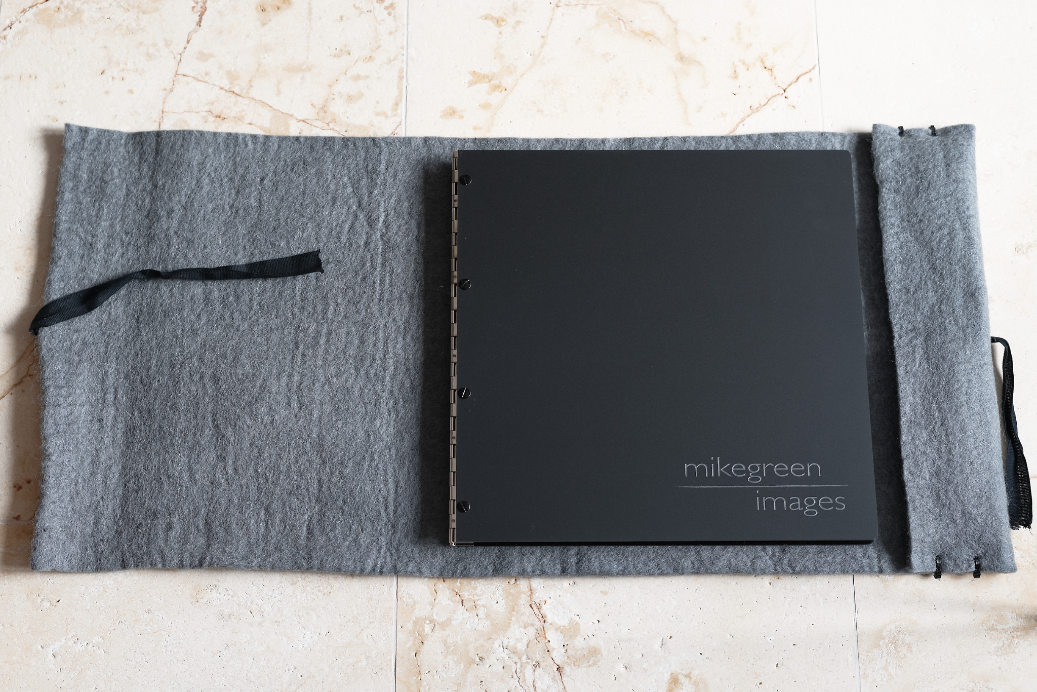
Of course, printing things is a lot more effort, far less flexible, and requires some input of money and time. All those things have led to my being initially somewhat cautious in handling the finished item: white cotton gloves, a thick, felt cover for the scratch-able, acrylic cover and, the first time I took it anywhere, a plastic bag as a cover to protect the felt cover-cover which I’d by then decided was also rather nice … (fortunately, I used a refreshingly unattractive plastic bag for the cover-cover-cover!).

You need to store it somewhere too. My twenty-three prints in their portfolio take up infinitely more space than the numerous digital copies and backups of them I also possess! So what though: I like collecting photography books and have written about the allure of photographic monographs before; this is merely a personalised, loose-leaf version of one on fine art paper, so I’m not overly bothered by the space issue.

And none of the other downsides is all bad; I’d argue that some sense of the need to care for the object enhances the experience of having created both it and the images it contains.

The major benefit

Most importantly, and the reason I’d urge anyone to create a physical, printed portfolio is that I now attach more emotional value to the portfolio-as-object than I ever did, or ever will, to the electronic versions of its contents; the prints mean more to me than they did before; they have more substance in both the literal and metaphorical sense. That feeling of having made something ‘more real’ was undoubtedly worth all the effort.

     Portfolio 1

Musings on: leaving the camera in the bag

Rannoch Moor: a name full of romance.

Alternatively: Rannoch Moor – fifty square miles of boggy, high level moorland consisting more obviously of water than of land, with what land there is being less than firm and universally wet.

Meanach bothy

Meanach bothy

I went for a wee donder across a corner of this last week, from the isolated, road-free Corrour railway station down into Glen Nevis; it seemed a romantic way of reaching Fort William, especially since the train journey to Corrour started at Ribblehead in the Yorkshire Dales, itself not the most metropolitan of railway stations: only I joined the train at Ribblehead; only I left the train at Corrour :-)

I was carrying 10Kg of assorted camera bits, plus another 5Kg of ‘useful stuff I might need when crossing remote marsh with all the rivers and streams in spate from persistent rain and snow-melt’. Nothing came out of the rucksack; I never took it off. I did make a few ‘record’ snaps with my compact camera, but the dSLR remained untouched all the way to Fort William. I’m happy with that choice.

Water of Nevis: centre

A lovely day out?

I’ve just deleted the first version of this sentence … I was going to say that ‘the traverse of this corner of Rannoch Moor was too enjoyable to stop and play with the camera‘, but that’s not exactly true. Yes, it was enjoyable, though in the slightly masochistic way in which achieving an objective despite adverse conditions can be enjoyable. Any given instant of trudging through ankle-deep marsh, fording alarmingly large burns, and being heavily rained upon whilst pushing into a 30mph headwind was, I have to recognise, not in itself ‘enjoyable’. The enjoyment was retrospective and holistic; all about the location and the short journey, rather than the minute-by-minute progression towards Glen Nevis.

The sense of place, of isolation and remoteness; that was the enjoyment of descending from Corrour, following the bank of the Abhainn Rath, and crossing the east/west watershed, where water from numerous sources collects and meanders, seemingly at random, before choosing to go westward, to form the Water of Nevis and emerge into Loch Linnhe at Fort William, or eastward, to empty into Loch Treig. After a few hours of seeing no-one and nothing but gently sloping hills and saturated ‘ground’, the cloud hanging just a few metres above my head and the rain on my hat muting sounds, the feeling of being ‘involved’ with the long valley was immense, pervasive, and only broken when I met the first other people of the day, just above the Glen Nevis gorge itself, at Steall Ruin.

Water of Nevis: left

Mesmerising isolation

The whole experience, though lasting only a few hours, was quite genuinely mesmeric and would have been disrupted severely by stopping to capture my surroundings on camera, let alone by taking time to explore and find compositions.

So entrancing was it that I was able to re-imagine the atmosphere when I returned from the Glen Nevis road-head a few days later, intent on photography, even though the land had by then been transformed into a verdant, welcoming, springtime paradise, bathed in warm sunshine … Except, it hadn’t, of course; this is Scotland after all. The conditions were actually rather similar, merely with somewhat less persistent and lighter rain, higher cloud and considerably less wind. Still grey and assuredly dreich though.

This was a good thing! I was returning towards the watershed area precisely because I wanted to attempt to capture something of the atmosphere which had found me so mesmerised earlier in the week; sunny and warm would have ruined it.

Water of Nevis: right

Separating experience and photography

The images which accompany this article do not show ‘how it was on the day’, but they do, for me, capture some of the sombre mood of the crossing and the overall grey-green immensity of the place.

That’s really the point of this piece: to photograph on the original walk would have spoilt it; the atmosphere would have been lost to me by the sheer act of stopping and fiddling with metal and glass high-tech. Not only that: I also suspect that I’d have been unhappy with the resultant images; both experiences would have been diminished. Instead, looking back, it was far better to enjoy the traverse in its own right, develop a feeling for what made it special to me, then return to attempt to make images which at least remind me of how I felt about the glen at the time. With luck, they may also evoke similar emotions in viewers who’ve not been there, or who’ve had the misfortune to do so on a sunny day!

It’s certainly possible that photographs made at the time would have better represented the crossing itself, but I’d have missed the immersive experience, without doubt. Writing this, days later, it feels far better to have absorbed the mood of the place on one day, thought about it for a while, and then used the same landscape later to interpret it photographically.

Glen Nevis trees

Glen Nevis trees

Not a unique idea …

This particular realisation was reinforced for me earlier this week when I received my copy of a stunningly beautiful photographic monograph, ‘Johsel Namkung, A Retrospective’ and read that he ‘walked for miles without a camera, looking for places to return to. Not searching for a picture, but for a place to return to where a picture might occur’. Perhaps a strong, emotional response to a place is best developed in isolation from capturing its reflected light? Maybe stronger images can result? And I would most happily have foregone the weight of all that glass and metal on the original walk! (Thanks to ‘On Landscape’ magazine for the review which prompted me to order the book.)

At the very least, compartmentalisation into walking and photographing allowed me to fully enjoy both the grim grandeur of a gloomy, Highland day and the subsequent, emotionally different time of using the landscape to make images. On this occasion it happened almost accidentally, but perhaps it’s worth adopting as a deliberate approach sometimes?

Musings on: cliché in photography

“A cliché or cliche is an expression, idea, or element of an artistic work which has become overused to the point of losing its original meaning, or effect, and even, to the point of being trite or irritating, especially when at some earlier time it was considered meaningful or novel.” Wikipedia

Using the above definition I can, unfortunately, state that:
“every image is a cliché, all you need is the right perspective”.

I need to define ‘right’ in the above statement. In this context it means some combination of: familiarity with the subject matter, when presented as a photograph; an attitude which decries such familiarity; and belief that anything repeated too frequently is in some way invalid, or at least less valid.

My overall point in this article will be that the perspective issue makes the above, bold and emboldened, statement accurate, which further implies that trying to work out what is, or is not, a cliché is, at best, unhelpful.

Fishfold

The origin of this article

This musing on cliché in photography started off a few months ago in Northumberland. For anyone who’s unaware, the coast of Northumberland is well-endowed with some very fine and highly varied castles; it may well not be possible to be both on said coast and also unable to see a castle, either to the north or to the south (assuming that it’s light, with clear weather, and that you’re not hiding behind a boulder, that is). Not only that, but there are some huge and impressive beaches to complement the various ruins and still-inhabited fortifications, and these are themselves often enhanced by threateningly crashing waves and dark skies. In other words, the area lends itself both to a certain type of shot and to not-infrequent use of the word cliché.

Early on during my week in Bamburgh, staying in a house overlooking its castle, I was joking with my fellow photographer friends that we couldn’t include castles in any images; too clichéd. Except – I was only half joking since, from the perspective of someone who spends a fair amount of time on photography-related social media, castles on the Northumbrian coast have been well-covered already; I really didn’t feel terribly inspired to use them in images.

Fortunately, at least for me, I overcame this self-inflicted objection and did capture a shot including one of the castles. It may not be especially original in photography circles, but it was, to me, a new subject; something I’d not done before. Whilst it doesn’t further photography as a whole, it furthered my photography in some small way. So, returning to perspective, or perhaps context: whilst the image I created is a cliché when considered in the set of all images ever made, it’s not so, and is therefore ‘valid’, in the rather smaller set comprising images made by me. I think this is a critical distinction.

Sweep

And my argument is …

That brings me to what has become the point of this article, a point reached by much genuine musing on the subject over the last couple of months. The widespread exhortation, on the web and other media, to avoid cliché in photography, evidenced in numerous articles describing how to avoid the ‘problem’, is itself becoming a cliché and is conceivably counter-productive.

A quick search and some skim reading produces several obvious candidates in the wealth of lists describing ‘photographic clichés to avoid’. Let’s pick the most commonly cited example to start with: sunsets. It’s undoubtedly true that sunsets fit the definition well for many people, especially for many photographers: they’re ubiquitous! Conversely, many non-photographers, quite possibly most non-photographers, do enjoy pictures of sunsets. Not only that, but from a learning point of view they’re quite informative: I certainly recall experimenting with how my first camera handled being pointed at the Sun and coming to understand more about exposure from doing so, as well as about the effect of the shape and size of the aperture; all useful stuff, even if the images were far from novel.

At the opposite extreme, I read an objection somewhere, very recently, to the ‘cliché’ of blocks of glacial ice at Jökulsárlón in Iceland. As a follower of photographic social media, I know where that comment comes from: Jökulsárlón is currently a very popular place to visit. That, however, perfectly illustrates my earlier point about perspective and context being critical to terming something a cliché: I would be amazed if any non-photographer, shown such an image, would consider it clichéd! Given time, naturally, the glacial lagoon and its melting ‘bergs may reach the lofty heights of sunsets on the cliché scale, or at least be in the same general order of magnitude; right now, most people have never heard of it, nor seen images from it. In other words, it’s only a cliché to a relatively small, self-selected audience; photographers themselves (and then only to a subset of those!).

Roughting heron

The logical conclusion of defining things as clichéd

So, both long-standing subjects and relatively new subjects can be derided. To what end? The common theme is advice to ‘avoid these subjects in order to be original’. How does that work then? After reading just a few anti-cliché articles, I’m fairly confident that there is little left in the real world which I could conceivably use as a subject for an image! If people follow the admonitions of these lists then the remaining subjects will rapidly diminish, leaving nothing whatsoever as permissible!

Of course, only ‘serious’ and ‘enthusiast’ photographers read such articles. Let’s assume that they all followed the advice given. Instantly, the only sunsets captured as images would be by ‘non-serious, non-enthusiast’ photographers …. Sunsets, et al, are popular subjects since people like them and because they’ve been used in the past to produce pleasing imagery. Surely there must still be potential to create a sunset image which adds something positive to the collective pot of such pictures? If so, then perhaps ‘serious’ and ‘enthusiast’ photographers are best-positioned to attempt to do that, even if the vast majority of images will, indeed, be redundant beyond their creator and his/her friends and contacts. The alternative, taken to the extreme, is that sunsets would only be captured by people less interested in photography. We’d still have lots of them, just with, arguably, a lower average quality.

I should point out that this article is at least slightly tongue in cheek; ultimately, none of this really matters. Of course, I do, personally, consider some subjects to have been a little over-used and I’m less inclined to use them in my images; but I’m not about to advise people not to photograph them! Their undesirability is solely my perspective; others may well have a different and equally valid view.

It seems to me that the very existence of a personal perspective on something as being a cliché will encourage photographers who want to be creative and original to find something else to capture. Importantly, those people probably don’t need to be told to do so, nor told what is and is not considered a cliché! Quite possibly, lists of things not to photograph will only succeed in discouraging people from photography altogether; people who might otherwise have worked things out for themselves, given time, and become more inventive in their choice of where to point their cameras.

Arc

Is there any upside to these lists at all?

After reading the various anti-cliché sites I can only see one real benefit to be derived from them: they do serve to reveal what other people consider cliché. If you’ve created an image of – let’s not be specific here – ‘thing X in weather Y’, it might be nice to know that the combination of X and Y is actually very well known and merely original in your experience, not to humankind as a whole. On the basis that knowledge is always good – itself debatable of course – knowing about the existing popularity of the X/Y combination may avoid embarrassment.

To me, however, even that benefit is at best rather spurious. Surely, it’s far better to take your own path through development as a photographer: start with the clichés if you feel like it; try to improve on what’s been done before; and maybe find that your vision develops in a more original way as you learn to see things in the World as potential images. Reading lists of things to avoid seems to me to be far too prescriptive. Not only that, but I enjoyed spending time photographing the Sun going down over Morecambe Bay when I started out ;-) Surely, that is a significant part of the point of practising photography?

In summary

Don’t seek other people to tell you what is and what isn’t a cliché or what you can and cannot photograph; that is itself clichéd and probably unproductive. Instead, work out for yourself what elements of the landscape you can use to make images. If that involves lots of well-photographed subjects along the way, don’t worry about it! There’s certainly less chance of the resultant images being considered ‘art’ if you choose clichéd subjects, but it’s merely more challenging to produce something noteworthy, not necessarily impossible. In any case, in a world where, it seems, everything can be considered to be a cliché if you choose the right perspective, there is really little choice …

To finish, here’s a shot of some tobacco leaves drying in a barn in Cuba; I’m sure that’s never been done before ;-)
Cuba: in summary

Monographs addendum

Since I published the previous article, Bruce Percy has published a very interesting and revealing piece on his blog describing the overall process of creating ‘Iceland: A Journal of Nocturnes’. It considers the organic development which leads to a finished artefact.

In my article, I concentrated on why photography monographs are intrinsically attractive to the viewer. Bruce touches on some aspects of why that might be too, but the main focus is on how their creation benefits the photographer themselves, as well as on the process; a process which is considerably more involved, subtle and recursive than might at first be obvious.

Very much worth reading, especially if you’re considering producing a book yourself!

Musings on: the allure of photographic monographs

I received Bruce Percy’s second monograph book today: ‘Iceland: A Journal of Nocturnes’.

At first I thought I’d write a review of it and to some extent this is a review, though it’s a rather short one, intermingled with the main topic of the musing which is photography books as a medium: it’s a medium that I like.
'Iceland; A Journal of Nocturnes' - cover image

I should start off by declaring an interest:

I was involved in the production of ‘A Journal of Nocturnes’ to the extent of reviewing the text and making some suggestions on flow, language and sequencing of images; Bruce even used some of those suggestions. Additionally, when I saw a near-final proof of the book, I wrote Bruce a letter describing how I saw it as a piece of art in its own right, something greater than the sum of its parts, rather than as ‘merely’ a collection of photographs and short, poetic essays; Bruce was kind enough to include the letter as a form of epilogue to the book.

So, I am clearly somewhat biased in the context of a review! I’ve also said before that I’m very keen on Bruce’s images and these of Iceland, in particular those made on the coast, are my favourite from his portfolio to date (though I think his Bolivia images vie with them for coherence as a place-based portfolio).

That last point, coherence, is important and I’ll come back to it as I think it’s a major benefit of photographic art books: it’s what, for me, gives them their allure – at least in part.

What of this, specific book then?

It’s an object of beauty! That’s not something I say at all lightly, I can assure you. The finished product is superbly printed on excellent paper and each of the embossed cover, the paper cover and the slip-case are themselves very fine indeed. Plus, the fonts used are gorgeous. I’m a fan of fonts and those in ‘Nocturnes’ are just right for the subject matter.

As to contents: clearly, I like Bruce’s images very much and this collection has a strong theme which give the book a good structure; I also enjoy the short essays which relate to the making of those images. Often, monographs are simply collections of images. That’s an elegant approach, but in this case Bruce has also interspersed the photographs with a few essays stimulated by, or pertinent to the creation of, the images in the book. This, for me, makes it even more interesting and attractive as an artefact. ‘Nocturnes’ does not rely solely on images to communicate, it also gives some insight into the creative process and, more widely, into Bruce’s development over his several visits to Iceland. This seems to me to be a great addition to – again – the book as a piece of art in itself which extends it beyond simply ‘a collection of excellent photographs’ and makes it something richer and deeper.

Photographic art books more generally

So yes, I can enthusiastically recommend ‘Nocturnes’; but what of the more general point about the allure of books of images?

I very much enjoy looking at images on a screen. Like many photographers, I’m fortunate in having large, high resolution monitors and photographs look excellent on them. It’s not the same as holding a book though. It’s not even close.

Holding a book, turning the pages, feeling the texture of the surface and perhaps the weight of it, even taking it down from a shelf and removing the slip-case, smelling the distinctive, subtle aroma of high quality print and paper even before you start to visually examine it and hear the pages turning; they’re all sensual involvement with the work which leaves simply seeing an image on a screen as a somewhat sensory-deprived shade of ‘the book experience’.

Beyond that, taking the nearest parallel as viewing and reading a pdf version on a large screen, the obvious, increased, almost intrinsic coherence of a self-contained object, the book itself, encapsulating all that the artist intended it to contain and no more, is also alluring. Yes, a pdf on a screen may have the same content, but unless you’re unnaturally talented at checking the file size and predicting the contents, or unless you study the table of contents carefully to start with, it can be somewhat ill-defined until you reach the end.

With a book, the wealth of sensory inputs to the experience of reading it means that you build up a feel for how much it contains, of what nature, and where you are within it as you read further; it’s an holistic, multi-sensory experience, not a slightly sterile one where the reading device is at best transparent to the process and at worst an intrusion.

With a book, you’re connected via multiple senses as you examine it.

And what about prints?

Prints are great. In terms of pure presentation, a well-mounted / framed print at the right size for the subject, hung in a suitable environment, is a marvellous thing, and perhaps an exhibition of coherent work rivals a quality book for overall experience; certainly it does so in terms of sheer visual impact. It’s a one-off or occasional experience though: with a book, the experience can be repeated and is more ‘intimate’; arguably more involving.

I should make it clear here that I’m not suggesting that books are ‘the only way’. I enjoy photographic exhibitions; I have a Kindle on which I read text; I use a tablet, laptops and a static computer; I even view things on a TV monitor once in a while – all those devices have their place, and if the only thing I had to view a set of photographs on was the tablet, I’d use it (I’d draw the line above using a ‘phone though!). Given the choice, however, I’d choose a finely printed book over any of those things as the best way of enjoying photographs and as the highest level of artefact which can be created from the starting point of a set of images.

I started off attempting to be analytical here but have largely failed as I’ve found myself so enthused by this type of book. No matter! ‘Iceland: A Journal of Nocturnes’ is a really lovely art object and exemplifies the somewhat lyrical comments above. I’m grateful to Bruce for having brought me to recognise the beauty that can be found in this type of photographic monograph.

A review, of sorts

Finally, since the above is not strictly a review, I’ll quote my letter from the book below. In it I tried to encapsulate what, at least as I experienced it, the book is about.

“Your journey from image inception to this book’s production parallels your artistic journey: your subconscious visualisations of the landscape have grown to encapsulate both the story of your visits to Iceland and the water-cycle of the island.

The book can be seen as describing a photographic day.

It dawns, calm and muted, on the black beaches with their isolated, glacial debris. It progresses along the coast to the sea-stacks, and thence inland to the vibrant drama of the cascades. It touches on the inland glaciers that are the source of the translucent ice-jewels, and on the rock over which they flow. And then it returns to the dark sand, this time with richer, optimistic blues as the ice reaches the coast and slowly melds with the ocean, ready to return to the glaciers.

It’s a wonderful, elliptical path through the iconic features of this harsh land and shows how an artist’s growth can mimic the cycle of nature. In this case, water and ice: same materials, different facets.

Journeys entwined with journeys; fascinating to observe and unequivocally inspirational.”

Now to make some more shelf space: paper may trump screens, but electronic media really do have the advantage when it comes to storing things!

Addendum
Since I published this, Bruce has published a very interesting and revealing article on his blog describing the overall process of creating the book. It considers the organic development which leads to a finished artefact. Very much worth reading, especially if you’re considering producing a book yourself!

‘White Scar winter hawthorn’ commended in landscape photographer of the year 2012 competition

I’m delighted to say that I have an image commended in the competition once again and that it will be published in both the ‘Landscape photographer of the year: collection 6’ book and the exhibition at the National Theatre.

White Scar winter hawthorn - LPOTY

Whilst it’s not my favourite of the images I had short-listed, I’m not remotely griping about that! It is the one I thought most likely to be selected, though I certainly wasn’t especially optimistic.

So, thanks very much to any of the judges who may read this; I appreciate the award greatly :-)

I was going to write some thoughts on photography competitions in general but thought I’d better read what I wrote when my ‘Zip’ image was commended in 2011. I think it’s fair to say that my views haven’t changed much, at least in part since these are the only two competitions I’ve entered. So, for anyone interested, here are my thoughts on LPOTY from 2011.

And next year?

I’ve not been out much making photographs in the UK recently, so I really must rectify that in the next six months or I’ll have nothing to enter for the 2013 competition. At least this year I’ll be able to get to the opening night at the National Theatre, unlike last year when I was somewhere in Arizona, in a snow-storm, at the time. I have a few days of photography coming up in Northumberland in December, so that should at least provide some images from the British Isles.

Congratulations to everyone whose images are included in the book and exhibition and I do hope to meet some of the people whose work I follow, on Flickr and elsewhere, at the opening night on the 12th November.

Musings on: obfuscating scale in photographs

“Obfuscation (or beclouding) is the hiding of intended meaning in communication, making communication confusing, wilfully ambiguous, and harder to interpret.” (Wikipedia)

In this article, communicating is the creation and display of a photograph, so the following is about ‘beclouding’ (rather a fine and appropriate word in the context of photography!) the scale of the contents of a photograph – something I’m increasingly fond of doing deliberately. My suggestion is that it’s often, but not invariably, a distinctly positive and useful thing to do, for a number of reasons which I’ll discuss.

I should make it clear that I’m considering this technique in the context of landscape photography. That’s not to say that it doesn’t apply in other genres, but I’ll constrain this short discussion to landscapes since that’s what I know something about!

I’ll also state up-front that I see this as yet another tool to assist with making images, not something which should be done without thinking, and certainly not a rule or guideline of any kind. Obscuring scale, or creating an image whose scale is actively misleading, has a purpose and result which may sometimes be appropriate but certainly shouldn’t be employed in every shot.

Zion cleft

‘Zion cleft’: about 30-40m. square, but that’s not really relevant.

The idea is …

My argument is, in essence, that by creating images where the scale is either ambiguous or difficult to determine without close scrutiny, the viewer is encouraged to look more closely. More importantly, they’re encouraged to look for longer. In short, an image in which the scale is obfuscated may engage the attention of the viewer more deeply than one whose basic structure and content is immediately apparent.

I know plenty of people who, when looking at images – and this is particularly true of photographs, as distinct from, say, paintings – will pause long enough to recognise that “this is an image of X” before moving on to the next. The very same people, presented with something whose content is not immediately apparent, will often study it for longer. To be brutal, it’s easy to glance at an image which is overtly representative, see it as ‘a photo of thing X’, and move on, unless ‘thing X’ is itself intrinsically interesting to the viewer. Conversely, if the overall form, colour and texture of the object is appealing, but it’s subject is not, it’s much more difficult to quickly absorb the message ‘picture of thing X’ and move on: obfuscation may oblige the viewer to stop and consider.

That longer examination is intrinsically a good thing from the perspective of the photographer, but it should also be good from the viewer’s perspective, assuming that what’s there is worth studying of course! It seems to me that I ‘gain’ more from all forms of art if I know and understand them better. That’s true whether the art in question is literature, music, sculpture, or visual images. It follows from this that studying a photograph for longer should give me, as the viewer, a better experience, more connection with the art and the artist, and all those other ‘art appreciation’ stalwarts. If I can encourage that, as the photographer, it’s surely of benefit to all concerned?

In miniature...

‘In miniature…’: perhaps 200-300m. across.

Why does this scale-abstraction help?

When I approach a photograph, if the scale of the subject matter is immediately obvious then I know I tend to look at the subject before I see the art in the image. If I can immediately identify the subject then my inclination is to consider the overall image based on my previous knowledge, not to see the image as a construction in its own right; I find it difficult to do otherwise and I’m presuming that the same is true for most viewers. My thought process is more “is this a good photograph of thing X” rather than “is this an appealing piece of art”. There’s nothing wrong with the former question, but it tends to preclude, or at least diminish the likelihood of, considering the second question. If scale-obfuscation can reverse the order of those questions then my feeling is that most people will look longer and appreciate the piece more.

Beyond that, I know that I find it entertaining to puzzle over what I’m looking at, including what its scale is. It’s an additional element in enjoying the image and for me that’s a good thing.

When is obfuscation not beneficial?

It goes almost without saying – but I’ll say it just to make sure – that if the photographer’s intention is to represent a place accurately then it’s probably not overly helpful to obscure the scale! Indeed, making sure that there is something to which the viewer can relate is explicitly desirable and part of why people sometimes use human figures in grand vistas.

This is also true when the objective of the photograph is to induce a feeling of awe or wonder at the subject matter, perhaps due to its sheer immensity. Making sure that the scale is unambiguous must be fairly important in such images. More than that, some viewers will be actively diverted from the main point, the ‘awe’, if the scale is not made clear. They may even be annoyed if they can’t discern the scale easily; probably not the typical desire of the photographer!

Talon

‘Talon’: 1 metre at the front, 2 miles at the back. Scale highly relevant but deliberately obscure.

Context is, as usual, everything

Whilst individual images may benefit from lack of scale, it’s generally also useful to establish an overall context for a set of images. The viewer may be able to build up an idea of a place through a series of intimate landscape shots, but they will mostly also appreciate a few images to set the scene. Again, it depends on the artist’s intent: is the image, or set of images within a project, about the place, or are they simply using the place as a source of raw material for abstraction, as a means of producing an emotional response in the viewer, but with no intention of portraying the reality of the places photographed?

My feeling is that I, when viewing images in sets, like some context most of the time, yet I also like abstraction… It’s all about achieving a balance between, at one extreme, showing things clearly and, moving towards the other end of the spectrum, obscuring them for the sake of adding interest, intrigue and deeper engagement from the audience.

Returning to the whole ‘art’ issue

As much-discussed in photographic circles, photographs are often not primarily – and this applies particularly in the UK – seen as art by many people; not in the way that paintings are. People mistake photographs for reality (not all people – some people!) and see them as mere representations of something attractive, not artistic creations in their own right. As also much-discussed, they’re not reality and never can be, for many, many reasons to do with how our visual systems work and the rather obvious fact of their two-dimensionality. Removing or obscuring scale may remove the image from reality sufficiently for the viewer not to see it as ‘just a photograph’ but to approach it as ‘art’.

I’m emphatically not about to suggest that obscuring scale makes a photograph more artistic than one whose scale is apparent, but I will assert that it can make some people initially perceive the image as having more merit, and therefore encourage them to engage with it more strongly. I’m just as guilty as anyone else of seeing ‘picture of thing X’ and moving on; hence I actively like obfuscation in other photographers’ work: it obliges me to look again or to look more closely!

Forceful mist

‘Forceful mist’: 2 metres wide, maybe 3 – scale deliberately obscured to add impact.

In summary

There are no absolutes in this. All I’m suggesting here is that it may be worthwhile to consider whether consciously abstracting an image from reality by concealing its scale from immediate recognition is worthwhile; whether it might engage the audience’s interest more? Further, looking more widely: is it worth introducing scale-obscured images amongst more obvious compositions to add variety to a project or set of photographs?

Personally, I think the answer is an unequivocal ‘yes’ to both those questions and I plan on continuing to do this.

There are many aspects to this approach and I’ve deliberately not attempted to cover everything I could think of around the whole scale issue, but any comments or arguments you have will be very welcome, either way! I should also point out that I very much like both completely abstract paintings and puzzles, so maybe I’m somewhat biased here…

C

‘C’: about 30-40 metres wide, and working that out from the rock is, to me, fun!