Musings on: the relationship between subject and viewing size

Needs to be bigger...
This may well be painfully obvious, and perhaps that’s why I’ve not seen anything written about it, but there seems to me to be a strong relationship between the subject matter of an image and the size at which it can ‘successfully’ be viewed. Specifically, the classic ‘big vista’ images – and that is well over half my images from Lofoten – don’t work as well when viewed on small screens.
Reduced emotional impact
That’s not to say that I’m not happy with those of my captures which feature wide expanses of landscape; I am. Viewing them on a relatively large screen (24″) whilst I made them, I was very pleased indeed with the results. Studying them subsequently on my other, smaller screens, as many people will be, I’m less thrilled; they seem constrained by the display dimensions. Effectively, the reduction in size – and I’m not saying that even 24″ is big enough here; it’s not in many cases – makes them tend to become ‘just pictures of landscapes’; they’re less ‘involving’ and have reduced emotional impact when seen smaller.
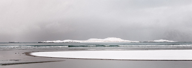
Conversely, the more abstract images I made in Lofoten and elsewhere – typically those of details – are relatively unaffected by viewing size. Yes, they’re probably better bigger, but the essence of the image is still very much there at reduced sizes; I don’t think that’s true of the big vista shots.

Probably best not seen too large!
Representation versus abstraction
I wasn’t especially aware of this when I processed my desert captures from the US. Many of those are largely about shape, form and texture, and in some cases colour, whereas the Lofoten collection is far more representational. Even though I set out in Lofoten to abstract the landscape in many cases, by creating work which was reminiscent of pen and ink drawings rather than photographs, they show obviously huge scenes compressed into small, rectangular or square boxes – it’s somehow frustrating to look at!
The key here seems to be subject matter. To take two obvious and well-known extremes:
- Mark Rothko’s ‘multiform’ works and his late period pieces – the blurred blocks of colour, most of which are far from being small paintings – do also ‘work’ very well indeed at smaller sizes, even postcard sizes;
- conversely, John Constable’s representational paintings of pastoral scenes lose an enormous amount of impact when seen on the web, or printed at postcard size – at least, they do to me.
Yes, I realise that the sheer scale of Rothko’s work is something which leaves people in awe, and I entirely concur with that. I contend, however, that they’re still captivating when reproduced smaller, albeit in a different way. The critical point here, to me as the viewer, is that, even if the experience of a small print is considerably different, they’re still effective. I don’t feel that I can say the same for Constable’s work, or for similar subject matter shown smaller than intended.
I’m interested in whether this is what everyone else finds (?).
Print ‘big vistas’… big?
Clearly, one solution to this problem – if such it is – is to print these vast landscapes, and to print them suitably large. At some point I shall certainly be printing the first of my images of Lofoten from my previous post – the shot of Olstind rising above a rack of drying fish heads – and it’ll be as large as the resolution of the file will tolerate. Nonetheless, realistically, the majority of individual views of a given image in 2012 and beyond are on screens measuring 15-17 inches, and that’s unlikely to change much.

'Pumpernickel' - not a landscape perhaps, but I like it
Since I see this as considerably more of a problem for landscape photographs which capture large areas, I’m now even more inclined than I was, before I went to Lofoten, to endeavour to find ‘intimate landscape’ compositions, or at least to abstract large landscapes as far as I can so that their form, texture and colour is the important thing, rather than representation of the real world landscape used as the basis for the image.
And some final thoughts…
Whilst I don’t have any firm conclusions from the above – it’s really just an observation which was new to me – I do like to identify some kind of potential, behavioural change in myself from each of these musings. From this one:
- I shall certainly consider printing things more often than I do currently, when the subject demands it;
- I am also encouraged to visit photographic art galleries rather more than I have in the past – which is to say, barely at all – in order to experience works at an appropriate size for their subject matter.
Beyond that, maybe a recognition of the style of presentation that an image will need will affect what I capture and, as I noted above, increase my tendency to capture smaller views. Realistically, I do like big vistas and I’ll carry on making them!
On a very positive note, however: one thing I’m continually finding fascinating with this whole process of making images, and the development of my vision of how and what I want to make, is that very development. In the past, it wouldn’t have occurred to me that different images lent themselves to different forms of viewing experience, or that prints were intrinsically very different from the same thing on a screen. As my thoughts evolve, all these things take on nuance which I’d never suspected was there. It’s a very stimulating, interesting and enjoyable ‘journey’!
At the risk of mildly contradicting the above: the following detail of Olstind, Lofoten’s iconic mountain, is much better when clicked on and enlarged – but that’s a resolution consideration rather than a scale thing ;-)

'Olstind's X'
-

- Needs to be bigger…
-

- ‘Olstind’s X’
-

- Probably best not seen too large!
-

- ‘Pumpernickel’ – not a landscape perhaps, but I like it ;-)
-

- ‘Slice’

8 Responses to “Musings on: the relationship between subject and viewing size”
I think you are onto something here, though having just bought an A3 printer, I’m beginning to move to much smaller prints – isn’t that always the way?!
Three related thoughts:
1. Your thinking before you make the image about how it is to be viewed is partly a pre-visualisation question, and it is very much about how *you* would like to see it. That is the most important perspective (and arguably the only one you can have), but others might see it differently, which leads to:
2. The smaller print is vastly underrated, I think, but very important to think about, not least for practical reasons: most us have limited wall space on which to hang large prints. And this in turn leads me to think:
3. Not all images are destined to be prints as such: the virtues of printing as a book, or some other form of collection is increasingly appealing to me. Not all images belong on walls, though we are (I am?) expected to think of that as a default display space.
I totally agree on point 1. The above is all about *my* response to certain subject matter at certain sizes, and in certain presentation media and, as you say, I can only pre-visualise things based on that. I could /try/ to second guess what possible viewers might want…. but I’m not sure that’s constructive ;-)
I also do agree on 2, despite the article. That said, my reaction would be that I wouldn’t tend to have prints of ‘big vistas’ at all unless they could be printed very large. As it happens – and I’d not thought of this when writing the article – I only have one non-abstract thing on my walls at home, and that’s actually an image of a large landscape, not printed big, but barely recognisable as a landscape ;-)
I’m going to write something about books in the future. Broadly, I think presenting photographic images in books is close to the optimum for all sorts of reasons, but I’ll not summarise that here as I haven’t really given it enough thought yet !
Thanks very much for the comment and tweets.
you are right about the size of the picture..i copied your pic and blew it up and it was really a great picture…small images just dont do justice to a picture like that
Glad you agree, Gary. If you’d asked, I’d have sent you a bigger version ;-)
A thoughtful piece, Mike.
I’ve mused similarly in the past. I think that a relevant additional consideration for landscapes is the representation of scale, or often for my photographs – emptiness.
It isn’t really sensible for me to project understandings and assumptions into anyone else’s head so I must just talk about my own ideas. I’ve found that my photography moved away from a conception of my photographs as representations of ‘a view” (that is, something that can be seen by anyone) towards a representation of my experience of being present in the landscape. This necessarily includes my emotional reaction to the landscape and this is often influenced by my perception of scale.
My pre-visualisation of my photographs does include a consideration of whether it will (need to) be a large print.
My response to this problem(?) was to buy an A2 printer!
Interestingly, I find that similar considerations apply to some of my still life / macro-esque stuff*; it’s arguable that these fit more clearly into your model of abstraction vs representation.
*(There are more printed versions of my tulip work from this week than online versions.).
Thanks for a thoughtful reply in return, Padraig.
I certainly empathise with the path you’ve taken from representation to, perhaps, evocation of emotion and experience, and I think that’s where the prime interest in making images falls for me – certainly at the moment and for a while now.
I too may start viewing possible captures with a consideration of how large they will need to be when finished. Whether I’ll invest in an A2 printer (impressive!) is indeterminate, but maybe one day. For now, I’ll stick with having big prints made for me occasionally I think.
Mike
I can’t really think of a situation where the smaller viewing size would be preferable. Maybe, a 1:1 macro reproduction. While technical skill and artistic intent can often be judged (and appreciated) from a small size print, the impact and detail appreciation will always be be stronger from a larger view.
On the other hand, if a small view is intended or forced, maybe a reframing with emphasis on important scene parts should be considered.
I think the medium for ‘delivery’ of the finished item is relevant. A small – at least not huge – viewing size is certainly applicable if you’re intending to produce the work in a book, for example. That’s not to say that a larger version, hung on a wall or projected or whatever, won’t have more impact, as you say, but if the primary outlet is via printed books, or on a screen, then it’s relevant to think about that I feel. And, as you say, if we take that printed/screen outlet as the ‘forced’ delivery medium, then it adds an extra dimension when considering what to include in the composition.
Thanks for the thoughtful comments,
Mike