mikegreenimages

Mike Green's thoughts on landscape photography

Locations for photography: the Salar de Uyuni, Bolivia

Writing about the Salar de Uyuni as a photographic destination and avoiding producing a simple eulogy for this astounding location is going to be difficult and, to be honest, I’m not going to try overly hard to achieve that. I do intend, however, in amongst the superlatives which will doubtless follow, to describe the area in terms of how it can be used for photography, what I think works and how to approach it logistically.

I should also point out that I’m deliberately separating the salar from the Andes of southern Bolivia, which are immediately south of it. It would be natural – at least for anyone who’s travelling a long way to visit the salar – to combine the two areas, and I’ve done so twice now, but since they’re radically different in character I’ve decided to write another article in a week or so describing the lagoons of Bolivia and the Atacama desert, in Chile.

I am not attempting to describe every facet of the logistics or photographic options here. Details such as climate, available accommodation and transport, etc. are all available on numerous sites. This article covers primarily those items most closely related to making a successful photographic trip.

Salar sunset

Firstly, a little of the eulogy thing and a few large numbers…

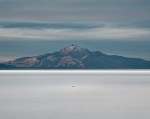
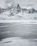
I’m a fan of barren, deserted places and wide expanses. I’m also rather enthusiastic about mountains. The Salar de Uyuni is 10,582 square kilometres (4,086 square miles) of salt, surrounded by Andean peaks and varying in thickness from ‘very little’, at the edges, to several metres over most of its area. Very approximately, it’s circular and about 100km across, slightly more in many places since it’s more of a blob than a circle. There are a few islands in this ancient, salt sea and they demonstrate the origins of the place by being composed of rock and coral, still remarkably sharp after something like 30-40,000 years since the water disappeared; one of my boots, whose toe I carelessly dragged across a piece, attests to that.

That’s enough of impressive numbers: the Wikipedia item, unsurprisingly, has a wealth of statistics and details on the geomorphology, with lots of ‘…x times larger than salt flat y…’ and similar comparisons with smaller, lower, thinner, less white salt flats! Ah yes, one last number: it’s 3,656m. above sea level, give or take less than half a metre at any point. That’s a pertinent figure to which I’ll return below under ‘altitude logistics’.

In summary: it’s a huge, startlingly flat area of very old salt dotted with cactus-covered, coral islands and with a backdrop of volcanoes. What’s not to like, at least in terms of spectacle and photographic opportunity? Admittedly, I wouldn’t want to attempt to live on it: doing so would surely be a brief and uncomfortable experience! Living temporarily on the edge of it, on the other hand, and taking daily excursions out to the islands, or to areas of nothing but salt, is fantastic! It’s about as close to other-worldly as I’ve ever come in a fair bit of travel. Forgetting about photography, just being on the salar is a brilliant experience and I’d recommend it very highly indeed.

OK, that’s most of the obvious superlatives used up so I’ll talk about photographic opportunities and logistics a little before returning to the extreme words a little later in this article.

So what is there to photograph?

At the risk of being trite: salt. Salt in lots of different patterns though, and in quantities which are pretty close to indescribable in their sheer enormity. As a foil to the salt, there are the islands. These are mostly covered with very large numbers of cacti – large cacti of the ‘several metres high’ variety – which grow in amongst the coral and rock and can be used to make excellent images as the low sunlight catches them (though not by me it seems – I was obsessing over the salt flat itself and failed to notice the photographic potential of backlit cacti).

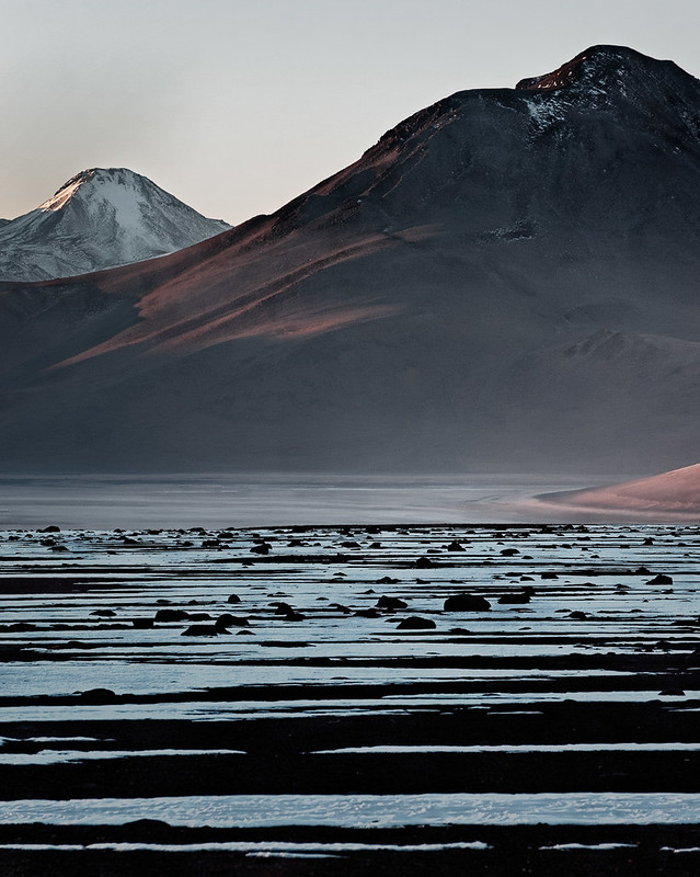
Returning to salt… The annual cycle of water on the salar – sometimes it floods briefly and very shallowly to produce a giant mirror which can be used for stunning ‘reflected sky’ images – means that the surface forms several different types of patterns. They’re all stages on the way to becoming the classic ‘hexagonal ridges on a fine, flat surface’, which means that different areas will have, variously, lots of tiny cones, zig-zag lines, a mixture of these with visible hexagons, and the full hexagons themselves, not to mention a broad gamut of in-between stages. This variety of surface – whose changes in nature can be felt as you drive across it in the dark – is fascinating. At least, it’s fascinating to me as I like the wide range of potential foreground patterns.

The sky-line will mostly be ‘distant mountains’, but they’re very fine mountains with some good lines of colour and folded shapes, so they do make a good back-drop to the salt. Alternatively, the few islands offer the potential for images with both salt and relatively close-by land. Of course, with a long lens, those distant volcanoes can form the major part of a composition.

Salar: Cerro Tunupa

And then there’s the sky

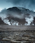
The sky is the tricky aspect of the salar, photographically. As you’d imagine, this is a dry area, meaning that the weather is consistently ‘good’, in the sense of clear and sunny. It also means that there often isn’t much in the way of cloud. There is generally enough to add some interest above the horizon at dawn and dusk though, particularly at dawn. Whilst the Sun is more than slightly above the horizon everything is bathed in very strong light, so during daytime the clouds don’t tend to be quite as relevant anyway since it’s tricky to make a worthwhile shot in those conditions. It’s still utterly spectacular of course ;-) Plus, heat hazes on the salt can give distant islands the appearance of hovering above the surface, floating in the air like the cover of a ‘Yes’ album or the floating forests from ‘Avatar’.

Colours

The colour palette is remarkable. It’s quite restricted, consisting of rather a lot of white, shades of brown and ochre in the mountains, and ‘normal’ sky colours, depending on the weather. What it doesn’t have is green, or very little of it anyway; don’t go there to photograph trees! What vegetation there is around the periphery (shore?) tends to be bleached to yellow and orange, and even the cacti are predominantly brown and red rather than green. This is perhaps partly what gives the place it’s slightly surreal appearance. Naturally, nothing but salt crystals grows on the salt itself.

Time of day

Yes, dramatic shots can be made during the hours when the Sun is above the horizon, but the salt really is very white indeed and the reflected light is extremely bright. The patterns more or less disappear under direct sunlight, at least for photographic purposes, and the coral islands suffer from harsh shadows reaching out from themselves onto the salar. If you’re taking more detailed shots then the shadow complexity of the boulders and coral, with their burden of dense cacti, is ‘unhelpful’, at best. In short, you’ll really want to be out shooting around sunset and sunrise and I liked the light best when the Sun was actually below the horizon, often by as much as half an hour (which is reasonably dark this close to the equator).

Having said that, when the Sun is very low, but visible, some of the islands can form dramatic shadows, the cacti become beautifully backlit, and if you’re spot on with timing it is just about possible to catch the light as it hits the salt surface. This next image is the second of three captures: two seconds earlier there was no direct sunshine; two seconds later there is next to no definition left in the salt. Timing is everything if you want to do this sort of thing!

Pixie dust

Time of year

I went in winter the second time, summer the first. I preferred winter since it’s quieter and it’s well away from the wet season. I’m not that keen on the mirror effect of the flooded salar really, at least in part since if the whole salar is wet, as it can be on occasion, then that’s pretty much ‘it’: you can photograph mirrored sky and hills, but not the salt patterns, what with them being inconveniently underwater. It’s either rare or unheard of to have a flooded salar in winter; hence my preference.

The important point to note is that it really isn’t very warm first thing in the morning in winter. Specifically, it often drops to approaching minus 20 Celsius, which categorically counts as ‘really quite chilly’ to me. Dressing appropriately is critical from a health point of view, as well as in order to retain the ability to capture photographs. That said, if you do dress properly, it’s entirely fine :-)

Later in the day, however, it becomes hot. The widest range we experienced was something like minus 20 Celsius before dawn to plus 25 in the mid-afternoon. Not only do you need to dress appropriately, you need to change a lot too, unfortunately. All these minor considerations are just that though: minor. If you’re properly prepared then it’s a very fine place to be indeed, as I may have mentioned already.

Altitude logistics

That last of my numerical points above is significant, at least in terms of anyone planning a trip to photograph the salt flat. If you’ve not been to altitude before – let’s say anything over 2,500m. – then it’s important to know that Uyuni is high enough to feel the effects, but generally not severely. Two miles up, as it is, is probably going to cause minor headaches for a day or so in most people, but nothing more serious in general, though you’d certainly not want to be running around much, at least not for a few days after arrival. Of course, if you’ve been travelling around South America and have been above 3,000m. for a while then you’ll be acclimatised and won’t have any problems.

The altitude is part of why I’m discussing the salar separately from the nearby, Andean lagoons: the latter are much higher, approaching 5,000m; an altitude at which acclimatisation is not a ‘nice-to-have’ but pretty much a requirement, and one which it’s also difficult to fulfil. I’ll talk about that in the next article. For the Salar de Uyuni, however, the issue is minor and there are effectively two approaches to getting there:
– overland from La Paz and then driving south for ten hours , which for most people will involve landing in La Paz at 3,600m. (the airport’s over 4,000m. but the city is in a huge cleft beneath it which appears as if it could have been produced by a giant with a very large axe);
– overland from San Pedro de Atacama in Chile.
The advantage of the second route, quite apart from the Atacama being rather excellent, is that it’s possible to spend a little time slightly lower: San Pedro is not much over 2,000m. Unfortunately, in my experience at least, that’s not actually high enough to acclimatise much, not to mention that it’s even further overland to Uyuni from San Pedro than it is from La Paz…

I’ve twice approached from Chile and I’d do it again if necessary; however, given completely free choice I’d go via La Paz in future. As I said, altitude effects are, for most people, not too severe when well below 4,000m. and it’s logistically somewhat easier to reach Uyuni from the north. Even if you’re planning on visiting the altiplanic lagoons as well as the salar, I’d do the latter first if possible, purely since a few days at 3,656m. is excellent acclimatisation before moving to the lagoons further south.

Personally, I have a great deal of experience of being at altitude in mountains and have rarely (only once) had a problem, other than in southern Bolivia, having approached from Chile, where it’s near-unavoidable to climb from just over 2,000m. to over 4,000m. in one day and stay there. The staying there aspect is the issue: acclimatisation is broadly achieved by ‘go high, sleep low’, meaning that you ascend a nice long way then drop back down to sleep about 300m. higher than you started from in the morning, ideally. From Chile, both times I approached that way, I noticed the 2,000m. change in altitude in the form of headaches. On the other hand, Uyuni’s low enough to be just mildly discomforting for a day or two and it can be reached from either San Pedro or La Paz in one long day. Much better!

Racetrack

Circumstance logistics

By that I mean the question of whether you visit the salar on a normal tourist trip, on a photographic trip, or independently. If you’re primarily travelling for photography, I’d strongly advise ruling out the first, ‘normal tourist’ option. These trips are excellent, but not remotely optimised for photography since they provide insufficient time and at the ‘wrong’ times of day. If you like huge expanses of über-bright whiteness, the middle of the day is perfect, but it’s a bit limiting, to say the least. Most trips will have sunrise on one of the rock/coral islands, but the time is severely limited, not to mention that everyone else is there too, dotting the pristine expanse of the salt with vehicles and people.

The other two options are photographically very similar. Essentially, travel around the salar is by Toyota Land Cruisers; some drivers are radical enough to use other 4x4s, but they’re in a tiny minority. That means you need a driver, and most companies will insist on a guide too. So, you either need to be on a photography workshop or you need to act all patrician and hire a vehicle, driver and guide yourself. The costs are actually not vastly different since Bolivia’s a very poor country and rates are relatively low, but planning is greatly simplified by going on an organised workshop. Also, rates are relatively low, not absolutely low: hiring a vehicle, two people and their accommodation is not cheap as such! This is a pretty good option if you have two or three people and there are no workshops available; very reasonable, cost-wise, and with complete flexibility.

I imagine it’s possible to hire a vehicle and drive onto the salar yourself but this would be, at best, unwise. I’ve not asked whether it’s actually allowed and it’s not something I’d seriously consider myself: the inconvenience of getting stuck might transform itself into actual danger!

It’s probably worth pointing out that a vehicle is essential. To ‘do’ the salar you need to get out onto it. Whilst people do cycle across it, that’s more of a ‘thing to do’ than a sensible means of transporting yourself around for photography. Lots of things are possible of course – I doubt that anyone has yet crossed the salar by pogo-stick, for example – it’s just that some options will have a higher comfort factor and a greatly increased likelihood of being able to capture some worthwhile images.

Personally, for photography, I’d not consider being there with less than a vehicle and a driver. Ideally there should be two vehicles. I’m not sure whether drivers are willing to drive out onto the salar at night with one vehicle: even in the dry season (most of the year) there are soft areas at the edges and some Land Cruisers do become bogged down and require rescue. In the wet season the whole salar can be covered with water and the 40-60kph driving speed enjoyed most of the year reduces to 5kph. So, if you want that astonishing reflection from somewhere in the middle, be prepared for a long, long drive out!

Colchani salt cones

Location logistics

The primary access point to the salt from the Uyuni side is via Colchani, where the salt is mined, essentially by hand at present. This is around half an hour’s drive from Uyuni itself and then you head out onto the salar through the mining area. That’s something of a grandiose term, incidentally. Essentially what it consists of is cutting troughs in the surface to form cones of salt about one metre high, using manual tools. These are then left to dry before being loaded onto the back of open trucks and stored in large piles in Colchani itself.

As an alternative to staying in Uyuni, or perhaps Colchani, there are a few salt hotels around the edges of the salar. I’ve stayed in the Tayka de Sal on the northern edge of the flats, just about in the centre of the second image in this article and a couple of hundred metres back from the edge of the salt (it’s 50km. away – definitely not visible!). As the name suggests, the hotel is constructed of blocks of salt and is of a remarkably high standard compared to most hotels in the area. I’d recommend this location above one of the many Uyuni hotels, due both to proximity to the main objective and to the views, though if you’re desperate to communicate outside Bolivia then, in common with most, if not all, locations around the area, there is no ‘net access.

I’d in fact recommend all the Tayka chain of hotels. They’re dotted across the southern Bolivian Andes and seem to offer the nicest, if not the cheapest, accommodation in the area. I stayed in the cheapest places on offer on my first trip. They’re functional, but if you’re not on a tight budget then the Tayka chain is well worth the extra expenditure.

The bottom line

As I suggested above, the Salar de Uyuni is comfortably the most bizarre and surreal place I’ve ever been and I’d recommend it very highly indeed to anyone who enjoys something a bit different.
– The sheer size and nature of the place is astounding.
– The colour palette is remarkable.
– The weather is predictable and well-suited to photography.
– The physical logistics, whilst they can take a bit of arranging, and whilst for most people they will involve a long journey, are actually not a significant problem once they’re in place.

All-in-all, it’s a fabulous photographic destination and I genuinely can’t recommend it highly enough.

As I think I said in reference to Lofoten earlier this year, if you can, go there!

Finally, if there’s something about the Salar de Uyuni that you’d like to know, or if you’d just like to comment on the place or this article, please do use the comment box below.


Musings on: the futility of [over-]planning

Immediately prior to my recent photographic trip to Chile and Bolivia I was concerned that I’d come back with similar images to those from my first trip, a couple of years earlier; I needn’t have worried.

Striation 2

Yes, I’d already convinced myself, pretty much (!), in my previous article that I’ve changed enough as a photographer to not need to be perturbed by the idea of spending a lot of time and money in revisiting an area, but it’s nice to be proved right. Except … I was decidedly wrong in predicting the actual images I would find myself creating on this second visit to the Atacama desert, the Andes of southern Bolivia and the Salar de Uyuni: wrong in nearly every respect in fact. Having been to everywhere I went this time so recently, I’d pre-visualised all sorts of things, none of which I captured as it turned out.

The good news from my perspective – and part of the point of this short article – is that it doesn’t remotely matter that I was wrong. In future, at least until I change my mind again, I shall not attempt to predict what I’m going to capture when I go somewhere; I now intend to ‘just go’ and see what happens! Of course, that doesn’t mean not doing the logistics in advance, sorting out a way to have flexibility on time of day and location – all the normal photographer things – but it does mean cutting back a fair bit on pre-visualising actual compositions in advance of even reaching the location.

Salar: Cerro Tunupa

I should contextualise this a little…

There are plenty of places I know well, to which I’ll return, and for which I shall most certainly continue to plan shots using personal knowledge, Google Earth, The Photographer’s Ephemeris – all the various technological toys we now have at our disposal. The key words in that previous sentence, however, are ‘know well’. There are trees and limestone pavements near to my house where I’m simply waiting for the ‘right’ weather in order to capture something with which to make an image. That approach works if you’re able to constantly and easily revisit a place, get to know it very well, plan things in detail. It’s why the photographic project concept often works so marvellously for many people.

Conversely, whilst I have a good idea of the type of terrain, the compositional elements available and the colour palette of these South American destinations, I most certainly don’t know them well enough to realistically pre-visualise anything specific. That last fact wasn’t clear to me until my trip in July. It is now: it seems to me that detailed pre-visualisation ‘off site’, so to speak, is a luxury only available, or at least only worthwhile, when combined with quite comprehensive familiarity with a location.

El Tatio

So, that’s one reason not to predict too much: it doesn’t really work!

Of course, it might work sometimes; arguably it does no harm either. My argument here is that, for me, it didn’t really do anything terribly useful either. I had half a dozen or so captures pre-planned and didn’t execute a single one of them.

There were all sorts of reasons for that, but they came down to simply not knowing enough about the climate or the details of the vast landscapes. Those two things can realistically only be gained by either: remarkably thorough remote research (not my thing – a little light reading-up, some gentle planning; those are both fine, but if I did too much I’d stop enjoying the whole experience of making images); long association with the landscape by being there a great deal (not entirely practical for most people when the ‘there’ in question is in the opposite hemisphere).

And the second reason for eschewing too much pre-planning is that, if you’re in the right frame of mind, in a wonderful location, and feeling even vaguely creative, it’s not needed in order to capture photographs which are worth working with. I had predicted, given my gradually-increasing inclination towards ‘intimate landscapes’, that my images would be of small details in the deserts and high plains; I planned for those shots but very few fit the description.

In practice, whilst I anticipated not taking any big vista images, I took several, both for context and because the scale makes them totally alluring. As to the intimate landscapes: yes, some of my captures might come into that category, but only if ‘intimate’ allows for simple frames with little obvious scale and whose actual dimensions are measured in hundreds or thousands of metres.

Pixie dust

Why is this a useful learning point (to me)?

Essentially, I’d fallen into the trap of over-thinking things to some extent. Again, I don’t think that did any actual harm, but nor was it especially helpful. Were I to spend a year in the area – or in any other area – I’m sure I’d treat it as I do the Yorkshire Dales; I’d head for particular places at particular times of day and year and in specific weather conditions. On what can only be a fleeting visit – two weeks in this case, and not all in one location – that level of preparation simply doesn’t, and indeed didn’t, buy me anything.

None of this is a problem though! The above is not intended to sound negative. It’s simply a continuation of my interest in exploring what does and doesn’t work for me when attempting to put myself in situations where I can capture the materials for making images. Everything is useful as a learning experience. All this means is that, when planning my next trip, I’ll spend less time trying to pre-visualise compositions in detail – more free time in other words :-)

Sinuous

And the trip?

The trip itself was a great success and I’ll be posting something about it in the next week or two; quite possibly two articles, one on the Atacama Desert in Chile and another on the Salar de Uyuni and the southern Bolivian Andes. At this point in time I think they’re sufficiently different in character, and certainly in accessibility, to be better described separately.

Whether it’s one article or two, my conclusions will be unequivocally positive on both locations; I’m still a huge fan of these deserted places :-)


Musings on: meeting my own expectations

About a year ago, thirteen months to be precise, I wrote about my ‘need’ to return to the Atacama Desert and the Bolivian Altiplano. To grossly summarise that article: I went there two years ago, before I’d started making images in any way which could be described as ‘serious’. Then I learnt a lot more about photographic image-making and felt that – it being an entirely spectacular location – I needed to return armed with my new knowledge about things photographic. To some extent I meant that in terms of technique but, far more importantly, I shall return with a different and, I hope, improved vision.

So, I booked myself a trip which will take me to all the same places that I’ve been to before, but with the specific, primary intention of capturing images, rather than general tourism. Not only that, but it’s in winter, so things should be different (notably, about 50C colder, it seems…. ). That trip is now imminent and, over the last couple of months, I’ve had a few fears of the journey failing to meet my expectations; I’ve had doubts about what I can bring back from South America in terms of images.

I’m pleased to say that those feelings are now resolved; at least, they’re not noticeable, so either I’ve resolved them or they’re now reassuringly suppressed :-) This article is about how I removed the anxiety.

Layered sunrise

So what was the problem?

When I went to the Altiplano a little over two years ago, I was just wandering about playing with my then-new, first, dSLR camera. I was merely travelling, looking at things, and pointing a camera at them. Yes, I was certainly trying to point the camera at interesting things and operate it properly, but essentially I wasn’t ‘a photographer’ at the time, simply a tourist with a camera. This time, I’ve set myself up to go there as ‘a landscape photographer’, with the specific intention of making images which improve on the first set I captured.

Not only that, but this time I’ll be using a better camera and lenses, I’ll be on a trip designed for photographers, and I don’t expect to see anything, in the big picture sense, that I haven’t seen before. All of that can add up to a combination of high expectations and a modicum of self-induced pressure to ‘perform’.

My niggling concern – I’d not go so far as to give it the title of a real worry, but it was certainly something which had come to nag at the back of my mind over the last few weeks…. my niggling concern was that I’d come back with the same shots, or even shots which aren’t as good as the first set. Bolivia from the UK is a fairly long way to go to reproduce something you’ve done before ;-)

And how did I resolve it?

Let’s assume that I have resolved the issue and that I’m not simply suppressing it. I’m sure the latter wouldn’t be a good thing, though that knowledge admittedly comes from watching films and television where ‘suppressing stuff’ is generally not seen as desirable!

The best aspect of this is that I sorted out my worries by re-reading a few of my own blog items!

Firstly, I read the Altiplano one to remind myself why I’d been so committed to going back. It re-established in me the feeling of just what a spectacular place I’m visiting. In that context, I actually don’t care if I fail to produce any new images: even if I had no camera, I’d still be more than happy to go on the same trip and watch the light change in those stunning locations. This time, I’ll be in the same places as before, but at dawn and dusk; the light will be different from last time, and it will change (unlike the previous visit, when it was effectively bright, unmitigated sunshine all the time, with very few exceptions). I’m entirely happy to sit and watch varying light in beautiful surroundings, whether or not I also use it to make images. That said, if it’s as cold as it might be then it’ll be more of an ‘experience’ to be there, rather than unequivocal ‘fun’, I suspect!

Secondly, I read my several Lofoten and US South-West desert ‘Locations for photography:…’ articles. For each location, I was reminded that I came back with shots which were, for the most part, markedly different from those I’d expected. True, I’d not been to either of those places before, but the point is that, once you’re in a place, what you see is generally different from your expectations and is affected by all sorts of factors; things like your mood, what you’ve seen photographed before and how it’s been photographed, the particular weather conditions, the time of year, and doubtless many other things. I’m confident that ‘vision’ is one of those factors, and since my vision has developed, so should the images I make from the Atliplano landscape.

Thirdly, I read a handful of my own ‘musings’ and could see how my thinking on image making has developed in the last couple of years. I’m not the same person now, in terms of my attitude to capturing light and making images from it, as I was in Chile and Bolivia in March 2010. Whether those changes which have occurred are for the better or not is irrelevant: I’m different as a photographer now and hence what I see in the landscapes of the Altiplano and Atacama can safely be expected to be different too.

Finally, it doesn’t really matter if I produce identical images. If I were professional, reliant on making new, saleable images to live on, then I think I’d quite rightly be somewhat trepidatious. I am, however, at a stage with my photography where I’m still very much developing the skills and attitude that are required: I can’t be certain of going to a place and making worthwhile images. Yes, I do expect to, but there’s no guarantee. Not that there ever is, but I suspect that many people can be more confident than I have a right to be at this stage!

Salar de Uyuni at dawn

And the point of this post really was?

This piece started out as a musing on performance anxiety (of a sort!), but my more significant, personal, learning point is that writing this blog is genuinely useful to me.

I said about eighteen months ago, when I first started putting my thoughts out in this form, that part of the idea was to have something to refer back to; to enable me to see how I’d changed. Re-reading those few articles I have, I can see that there are certainly developments over the period.

There’s more to it than that though: by reading my past thoughts I’ve been reminded of various things which have all fed into my experience as a photographer and which have proved specifically useful right now in allaying the minor ‘fears’ I had. Doubly useful then, and perhaps next time I go back and read some of this I’ll find another broad category of usefulness?

A suggestion

I’d therefore like to suggest that the activity of writing a web journal / blog, or even just keeping a personal diary of thoughts and attitudes to photography as you progress, is a really rather good idea, if only for the wholly selfish, but compelling, reasons that it can serve as reassurance, as reinforcement, and as a record of development. Only the last of those things was more than a vague concept when I started, and this is the best instance so far to prove to myself both that the original idea was valid and that there are other benefits too. And if anyone else finds value in these musings and location commentaries, then that’s even better!

The images in this article are, of course, from my first trip. I’m now looking forward to seeing how different the next set will be!

Shadowed peaks

Musings on: are desaturated images more expressive than mono or ‘full colour’?

I was thinking of entitling this article:

“is the preference some people have for muted, desaturated or ‘dull’ colours a deliberate overlay of what we consider to be ‘refined taste’ on our natural liking for exuberant, saturated, vibrant colour?”

That seemed a little long for a title, but it’s essentially what this posting is about. Put another way: do we – some of us – find less saturated colour more appealing because it’s ‘more artistic’ than vivid colours? If so, then is this preference, to put it slightly pejoratively, an attempt to be terribly clever, civilised and sophisticated by suppressing our instinctual attraction to the more lurid end of the saturation scale?

To start with, I probably ought to declare which side of the fence I’m on here. I like desaturated colour. In fact, I like black and white images, I just haven’t managed to get the hang of creating them as yet; and I don’t prefer them over colour. Having said that, I also like some images which have plenty of colour, though those tend to be abstracts rather than representative landscapes. Certainly, what I like to make is on the more muted end of the scale. So this is in part a musing on whether I’m being pretentious in that … I think not, and I’ll explain why, but I’m clearly biased ;-)

Spine

I should also mention that this is effectively part two of my previous article on whether there is such a thing as ‘over-saturation’. I concluded in that piece that, provided the photographer isn’t misrepresenting what they’ve made – claiming that their images faithfully reproduce reality when they don’t – the degree of saturation is purely a matter of taste and artistic intent. That, then, is the starting premise for this musing. (Incidentally, the idea that two-dimensional images can ever ‘faithfully represent’ reality is decidedly suspect, but that’s probably a subject for another musing!)

We are instinctively attracted by saturated colour

Perhaps a worthwhile perspective is to explore just why it is that people are drawn to bright colours. Yes, there is always the argument that photo-processing software allows us to intensify colours, so we do, and such manipulation undeniably produces arresting images when seen in thumbnail galleries; but why do people notice bright colours in the first place? Maybe it’s just how we are? And if it is, then perhaps the fashion for admiring muted colouration really is a subconscious, or even deliberate, statement that we have overcome our natural state of gasping and saying “wow” when we see something bright and shiny?

I think it’s undeniable that we are naturally attracted to the bright and saturated in our world. That could be down to any number of things, so here are a few ideas, extensively backed up by no scientific knowledge whatsoever on my part. I’m merely speculating on how pre-civilisation humans might have benefited by having their attention drawn to objects or phenomena exhibiting saturated colours.

  • Orange and red tend to indicate heat, which in turn implies danger. It’s in our interests to notice and examine the source of such colours. Conversely, heat is remarkably useful to survival so, either way, spotting things with ‘hot’ colours would be a helpful trait. The more saturated they are, the more heat: again, potentially a very good thing to notice.
  • Fruit and berries are often brightly coloured and they generally constitute food. Without a convenient shop to go foraging in, I’m sure it would be beneficial to be visually drawn to pick out such things.
  • Similarly, bright, verdant green – the brighter the better – also tends to indicate food nearby, as well as that vital resource, water. With water being so fundamental to survival, finding bright greens with splashes of other colours would generally indicate access to food, warmth, water, continued health and all those things which make us comfortable.
  • In contrast to all of the above, grey, desaturated and drab colours suggest cold. Humans aren’t really fond of the cold in general, so we’re inclined to disfavour anything which looks uncomfortable.

If any or all of the above are true, then we in the 21st century have developed from people who were quite rightly inclined to seek out colour, either to enjoy what it promised or to recognise it as danger. Either way, it would be both eye-catching and attractive, in the literal sense of making us want to go and look more closely. If so, it’s perfectly understandable that we should continue to behave in the same way when presented with images of the World around us.

I’ll make the rash assumption that the above is true …

Given that saturated colour is instinctively attractive to us, it follows that, as we strive (or profess?!) to become more sophisticated, perhaps actively rejecting these historical preferences really is an attempt to overcome instinctual behaviour and to demonstrate our high level of education by preferring things which we would not naturally like over those which we should be drawn to? I’m not necessarily saying that it’s a conscious effort; it could easily be unconscious, a rebellion against succumbing to instinct.

If that’s the case then I’m certainly guilty! As my work reflects, I very much like desaturated images, though not to the exclusion of colour when it’s appropriate. I don’t think rejection of instinct is entirely ‘it’ though; for me there’s more to it than that: I have a vision of what I’m drawn to most, and hence what I like to create, and it simply isn’t primarily about colour. Indeed, colour can detract often from that vision, so my inclination is to remove it rather than add more.

But then, what about black and white, or mono?

Monochrome images abstract wildly from reality, whether they’re of landscapes or anything else. We don’t see in mono, so any image consisting solely of tonality is categorically unnatural and simplified. To me, these features mean that the compositional aspects of the image are both more apparent and more important when mono is employed. Without colour, we’re left with tonality used to express patterns, textures and shapes. That, in my opinion, is a good thing – it’s less ‘obvious’.

A recent, non-photography experience of the near-removal of colour convinced me of this even more. I was watching Danza Contemporanea de Cuba in Newcastle a couple of weeks ago. As with most contemporary dance, there were colours involved in the clothing for two of the three pieces, but the last, accompanied by Steve Reich’s repetitive, purely percussion piece ‘Drumming’, was in near black and white. I was very aware of how the lack of colour and the simplicity of the instrumentation, gave added prominence to the patterns of movement and shapes formed by the choreography. The other two pieces that evening benefited from the colours used; this one benefited from the lack of colour. I think this has a direct parallel in desaturated photographs.

Even that isn’t entirely ‘it’ though; if it was, I’m sure I’d have taught myself how to pre-visualise and post-process in black and white by now!

Desaturated colour offers the best of both worlds

I have concluded that I actually prefer to use the slightly desaturated look over either mono or colour: it can be more expressive since it retains the ability to use the colour dimension of the capture, yet also makes shapes, tonality and composition relatively more important than they would be in a ‘full colour’ image. I don’t want colour to be the dominant feature of images, but nor do I want to use purely tonality. For me, desaturating colours slightly, but not to the point of monochrome, offers the best of both worlds: it avoids an image shouting “look at me, I’m colourful” and allows the otherwise more subtle compositional aspects to feature more strongly in the viewer’s emotional reaction to the photograph. I’ll summarise this as:

over-saturation tends to dominate an image, whilst removing colour completely loses a major dimension of many images; desaturating colour can balance all the dimensions better and give a greater emotional impact, or at least more freedom of expression in attempting to create that impact.

Olstind across Sakrisoya

This has been an interesting subject to think about and I’ve definitely clarified and changed my views somewhat. I conclude that what matters to me in choosing how to manipulate saturation in my images is achieving some kind of balance which conveys to the viewer the emotional response I had to the scene I captured. Generally, removing some of the colour gives prominence to the things which matter more to me, without abstracting too far from reality by going all the way to mono.

Of course, any given image may ‘balance’ better with either lots of colour or no colour; it just seems to me that slightly reduced colour most frequently provides the best balance in the images I want to create. Ultimately, for any photographer, any manipulation of saturation is purely personal, artistic vision. What matters is why it’s done, what the final effect is, and whether what has been done adds to the artistic statement the photographer was trying to make.

I’d be very interested to hear your views on the above, so please comment if you have anything to add or want to agree or disagree!

Musings on: is ‘over-saturation’ a reasonable and fair term?

I’d like to answer the question in the title with a simple ‘yes’ or ‘no’, but I can’t: as in so many things, context is everything.

Similarly, if I could just say “I’m ambivalent”, that would be a pleasingly simple answer too. Fortunately, from the point of view of this article, I can’t say that either. Having thought about this for a few days, I now have a fairly clear set of views on the whole ‘over-saturated’ debate which seems to rage across the sharing sites perpetually: that’s the subject of this post.

Why this musing?

A few days ago, I had never given the question of colour saturation more than cursory consideration; I was prompted to do so by comments on my recent Flickr post, ‘Olstind dawn’. Unlike the majority of my images, it’s not exactly muted in its colour palette. As it happens it is desaturated, but it’s still very much on the colourful end of the scale by most standards! As the comments came in, I posted a link to a ‘before’ version of the image and that produced a split between those viewers who preferred the bright, ‘as it was’ version and those who thought my more muted one was better.

To me, the version I uploaded to Flickr still looks unrealistically colourful, even though I know that the real colours were even more wildly outlandish. I think I chose to subdue the colour because I liked it that way, but I’ll admit that there may have been an undercurrent of “this is ridiculous; no-one will believe it” in there too! Having then done a search for the word ‘saturation’ on this blog, I found that I’d only used it twice: once to say that a particular image, ‘Charcoal sunset’, had been boosted slightly; once in an article on the learning benefits of making ‘not-so-good’ images. So, given what a prominent topic the excessive use of the saturation sliders can be, I thought I’d put a few thoughts together.

This actually started off as one article, but it’s such a big topic that I’ve split it into two short pieces, the second of which I’ll publish in a week or so. This one deals with whether manipulating saturation can be seen as ‘right’ or ‘wrong’; the second will consider why it might be that we have, collectively, certain preferences, and how those preferences might be applied. I should point out that all of this is entirely opinion; there really is no definitive answer to the question, merely my contribution to the debate!

This is my desaturated version of ‘Olstind dawn’.

Olstind dawn

So what is the context?

I should point out that I am emphatically restricting this to a discussion of colour saturation in landscape images; this is a complex enough debate to contextualise as it is, without introducing even more variables, and I don’t think anyone would want to read the several thousand words of caveats I’d require in order to expand beyond the landscape genre ;-)

So, within that ‘landscape images’ context, what more is needed to answer the question?

Essentially: intent.

Intent is critical; it defines the objective the photographer has in creating the image. To take that a step further, it’s really expressed or stated intent. There are three broad categories to consider, as follows.

  1. ”This is how it was”. From my perspective, if I claim that my image represents a true capture of reality, then I am obliged to make the colours as real / genuine / authentic – pick your word! – as possible. More than that, I think I should also qualify the statement by adding “…as close as I can make it”, or some such acknowledgement of the failings of human memory, the visual system, and photographic method. The key point is that it should be made clear to the viewer that what they’re seeing is definitely intended to represent, accurately and truthfully what was there at the time. I never do this myself, nor remotely intend to.
  2. “This is how it looked to me”. This is the murky middle ground and I think it’s an abrogation of responsibility. That particular statement, and similar, has an implication of “that’s how it was” even if, taken literally, it doesn’t quite say that. For example, it doesn’t explicitly acknowledge that I might have been in an especially positive mood, seen vibrant colours everywhere and hence processed the image to reflect that mood, pumping up the saturation to suit. It definitely requires qualification to the point where it becomes a completely new statement. Usually, whether consciously or not, descriptions of this sort conceal all sorts of post-processing manipulations which are rarely made ‘public’. (And I include in that using the ‘vivid’ setting on the camera and treating the result as ‘how it looked’.) To me, this type of statement is the problem which causes so much debate. Anything falling into this category should be qualified and moved to one of the other two! Needless to say, I don’t do this either.
  3. ”This is my interpretation of how it looked”, or ”this shows how I felt about the subject”. These seem like perfectly reasonable statements; they’re inarguable. They make no claim to reality or authenticity; they acknowledge that I’ve used the landscape as part of the input to creating a final image, but that what the final image contains is a composite of the original subject and my artistic interpretation; an amalgam of emotional context, pre-visualisation and intent. This summarises my personal intent in every image I make: no claims whatsoever of authenticity :-)

Much of the contention around ‘over-saturation’ stems from people using variations of the second statement or, less commonly I hope, claiming the first whilst delivering something which clearly isn’t an authentic representation of the original scene. i.e. photographers are exaggerating the colourfulness of their subject, either deliberately or since they don’t recognise that they’re doing so. The simple fact is that it should only matter that an image features increased, or indeed decreased, saturation, compared to the original scene, if the photographer simultaneously claims that it is a truthful representation of reality.

‘Be honest’, in other words!

Unless misrepresented as ‘a true record’, any given image is simply artistic interpretation. There’s nothing wrong with saying ”I made this bright and colourful since I like the look of it that way” – it’s simply a matter of preference. Yes, I’m sure no-one reading this would inappropriately misrepresent something as ‘reality’, but it is very easy – I’ve certainly done it – to criticise something for being hyper-real without first determining the creator’s intent.

Is modifying saturation intrinsically either good or bad?

If the photographer’s intent is clearly stated as one of representing reality then it’s obvious that saturation should only be changed in order to achieve that. Simple. End of story. The job is to show real colours, and anything which deviates is unequivocally wrong. This is the first instance above and we can still, of course, debate how good a job they’ve done.

Ignoring deliberate deception – pumping up the colours and claiming that they’re real – that leaves changes in colour saturation which knowingly move the final image away from pure representation. It seems to me that this can only be judged in terms of results, and those results are so tied up with artistic intent that there simply isn’t an answer. I can look at a particular image and say that it’s too saturated for my liking, but I can’t remotely claim that as an absolute. If the photographer has a target audience in mind and that audience is known to rave about saturated colours, it’s reasonable to assume that boosting colours will be popular – there’s nothing wrong with that.

Another facet is that it’s currently fashionable to admire muted colours; images displaying a desaturated look are perhaps more likely to be described as ‘art’, purely as a result of that desaturated appearance. Fine. This, too, is neither wrong nor right, it’s simply an observation of current preferences. It may even be a backlash against the trend for bright, saturated colour which could itself be argued to have begun – in photographic terms – with the advent of colourful films such as Fuji Velvia and which has since continued with the appearance of post-processing sliders in the digital age.

It’s also possible that, since many ‘old master’ paintings are relatively dull, we automatically associate ‘muted’ with ‘fine art’. Yet when they were originally painted, many of these paintings were truly vibrant; they’ve just aged and faded! Centuries old paintings which have been ‘aggressively restored’ can sometimes be considered to be positively garish! (At least, they can by me and I’ve heard that comment from more than one other person…)

Possibly the really tricky area is in images which stray just slightly from reality. It’s easy to say that something is too colourful, or too lacking colour, when it’s obviously far from the original scene; when it’s close, but not quite right, then it becomes tricky – much in the same way that images which are nearly, but not quite, square tend to jar somewhat with lots of people. Perhaps avoiding ‘nearly-but-not-quite-right’ is the way to go? Joe Cornish often talks about the end result of post-processing being ‘credible’: that seems to be an excellent criterion for judgement. And if it’s incredible, then make it clearly so.

So, where does that get us?

The only thing that I can conclude so far is that ‘anything goes’, provided it’s not represented by the photographer as ‘true to life’, or whatever the chosen phrase is. So I shall end this article with an admonition to please consider the motivation and intent of an image before declaring it to be ‘over-saturated’ – I’m certainly going to attempt to do that. That’s not to say that ‘over-saturated’ is an invalid criticism, but it’s not an especially reasonable one without first exploring the context. Further, if we do declare an image to be ‘over-saturated’, it should always be qualified with ‘…for my taste’!

The next step?

Returning to my earlier comment on the much-used and insufficiently precise ”this is how it looked to me” idea, I personally think that many images posted on photo-sharing sites and described as ‘true colours’ could fairly be described as very over-saturated for my taste! And, irrespective of their veracity, I do seem to prefer muted colours in general; not to the exclusion of vibrancy and saturation – they have their place – but I certainly prefer the ‘dull’ end of the scale, at least when restricting the view to landscape photographs.

So, the question for the second part of this musing is that of why some people prefer restrained colour palettes over joyous, vibrant ones, and vice versa.

And finally, this version of ‘Olstind dawn’ is what I believe I saw….

'Olstind dawn'

Thanks to Robert Garrigus for specifically suggesting this musing.

Musings on: the relationship between subject and viewing size

'From Reine'

Needs to be bigger...

My recent trip to the Lofoten Islands in Arctic Norway has led to a musing whose implications I’ve yet to fully conclude upon, but I thought I’d write it up and see if anyone has any input or violent disagreement. (If you do, please don’t hesitate to use the comment form below!)

This may well be painfully obvious, and perhaps that’s why I’ve not seen anything written about it, but there seems to me to be a strong relationship between the subject matter of an image and the size at which it can ‘successfully’ be viewed. Specifically, the classic ‘big vista’ images – and that is well over half my images from Lofoten – don’t work as well when viewed on small screens.
'Slice'

Reduced emotional impact

That’s not to say that I’m not happy with those of my captures which feature wide expanses of landscape; I am. Viewing them on a relatively large screen (24″) whilst I made them, I was very pleased indeed with the results. Studying them subsequently on my other, smaller screens, as many people will be, I’m less thrilled; they seem constrained by the display dimensions. Effectively, the reduction in size – and I’m not saying that even 24″ is big enough here; it’s not in many cases – makes them tend to become ‘just pictures of landscapes’; they’re less ‘involving’ and have reduced emotional impact when seen smaller.

Conversely, the more abstract images I made in Lofoten and elsewhere – typically those of details – are relatively unaffected by viewing size. Yes, they’re probably better bigger, but the essence of the image is still very much there at reduced sizes; I don’t think that’s true of the big vista shots.

'Decapitated'

Probably best not seen too large!

Representation versus abstraction

I wasn’t especially aware of this when I processed my desert captures from the US. Many of those are largely about shape, form and texture, and in some cases colour, whereas the Lofoten collection is far more representational. Even though I set out in Lofoten to abstract the landscape in many cases, by creating work which was reminiscent of pen and ink drawings rather than photographs, they show obviously huge scenes compressed into small, rectangular or square boxes – it’s somehow frustrating to look at!

The key here seems to be subject matter. To take two obvious and well-known extremes:

  1. Mark Rothko’s ‘multiform’ works and his late period pieces – the blurred blocks of colour, most of which are far from being small paintings – do also ‘work’ very well indeed at smaller sizes, even postcard sizes;
  2. conversely, John Constable’s representational paintings of pastoral scenes lose an enormous amount of impact when seen on the web, or printed at postcard size – at least, they do to me.

Yes, I realise that the sheer scale of Rothko’s work is something which leaves people in awe, and I entirely concur with that. I contend, however, that they’re still captivating when reproduced smaller, albeit in a different way. The critical point here, to me as the viewer, is that, even if the experience of a small print is considerably different, they’re still effective. I don’t feel that I can say the same for Constable’s work, or for similar subject matter shown smaller than intended.

I’m interested in whether this is what everyone else finds (?).

Print ‘big vistas’… big?

Clearly, one solution to this problem – if such it is – is to print these vast landscapes, and to print them suitably large. At some point I shall certainly be printing the first of my images of Lofoten from my previous post – the shot of Olstind rising above a rack of drying fish heads – and it’ll be as large as the resolution of the file will tolerate. Nonetheless, realistically, the majority of individual views of a given image in 2012 and beyond are on screens measuring 15-17 inches, and that’s unlikely to change much.

'Pumpernickel'

'Pumpernickel' - not a landscape perhaps, but I like it

In many ways, this is a shame. Whilst the ability of the web to enable people to see various forms of art is undeniably both fabulous and a marvellous resource – I’m certainly not decrying it – the absolute quality of the experience of seeing a piece of work from the big landscape genre on a small screen is, in my opinion, much reduced as a result. We see more work, and we see a wider range of work, but the emotional impact of much of that work is sadly reduced.

Since I see this as considerably more of a problem for landscape photographs which capture large areas, I’m now even more inclined than I was, before I went to Lofoten, to endeavour to find ‘intimate landscape’ compositions, or at least to abstract large landscapes as far as I can so that their form, texture and colour is the important thing, rather than representation of the real world landscape used as the basis for the image.

And some final thoughts…

Whilst I don’t have any firm conclusions from the above – it’s really just an observation which was new to me – I do like to identify some kind of potential, behavioural change in myself from each of these musings. From this one:

  • I shall certainly consider printing things more often than I do currently, when the subject demands it;
  • I am also encouraged to visit photographic art galleries rather more than I have in the past – which is to say, barely at all – in order to experience works at an appropriate size for their subject matter.

Beyond that, maybe a recognition of the style of presentation that an image will need will affect what I capture and, as I noted above, increase my tendency to capture smaller views. Realistically, I do like big vistas and I’ll carry on making them!

On a very positive note, however: one thing I’m continually finding fascinating with this whole process of making images, and the development of my vision of how and what I want to make, is that very development. In the past, it wouldn’t have occurred to me that different images lent themselves to different forms of viewing experience, or that prints were intrinsically very different from the same thing on a screen. As my thoughts evolve, all these things take on nuance which I’d never suspected was there. It’s a very stimulating, interesting and enjoyable ‘journey’!

At the risk of mildly contradicting the above: the following detail of Olstind, Lofoten’s iconic mountain, is much better when clicked on and enlarged – but that’s a resolution consideration rather than a scale thing ;-)

'Olstind's X'

'Olstind's X'


Locations for photography: the Lofoten Islands, Norway

Essence of Lofoten: Olstind + fish

To avoid any doubt introduced by the scant mention of negatives below…

I’m loath to be too gushing (just on general principle!) but Lofoten is unequivocally a fabulous place to visit in winter, both from a photographic and from a purely sight-seeing point of view. I’ve just returned from my first trip there and I think it highly likely that I’ll return one day, perhaps in summer, but more probably in winter again.

I feel I should start off by ‘confessing’ that, until about a year ago, I’d not knowingly heard of Lofoten! I’d travelled in Norway before, pretty much the length of it, but that was a long time ago and we drove around ‘seeing what happened’… What happened was that we missed one of the best bits – perhaps the best bit! Now, everyone I mention Lofoten to seems to have either heard of it or actually been there, so it’s rather less obscure than I’d imagined.

Lofoten

Where and what it is

For that tiny minority of people reading this who aren’t intimately acquainted with the location and topography of this string of islands: they’re towards the north of Norway, inside the Arctic Circle, and tenuously connected to the mainland by a series of bridges and undersea tunnels.

For context, I flew into Leknes, which is a little over an hour by road, or approximately 70Km, from the southern tip of the islands at Å (pronounced something like ‘awe’, and, appropriately, the last letter of the Norwegian alphabet). This area is essentially the southern half of the string of islands called, collectively, Lofoten. This isn’t intended as a place name list, and there are many sites which describe what’s where and how it’s strung together, so I’ll stop there! (For anyone feeling pedantic when reading this, the little archipelago of Røst is really the end, but there’s a lot of water between it and the ‘main’ Lofoten archipelago, so I’m choosing to see Å as ‘the end’ ;-) )

LofotenIn appearance, the best analogy I’ve come up with for Lofoten is that of a somewhat broken up series of giant Toblerone bars, with the tops of the triangles protruding from the Norwegian Sea and their sides plummeting straight down into it. There is not an awful lot of flat land in Lofoten; just triangular mountains and water. I’ll concede that the Toblerone analogy suggests a regularity which is fortunately not evident, but it does nicely indicate the angle and overall, pointy ‘nothing here but mountains’ nature of the place!

Mountains in most places rise gradually; these don’t. Many of them look as if a monolithic troll with a meat cleaver and a penchant for triangles has taken a perfectly normal mountain and fashioned something sharp and tooth-like from it with a couple of slanting blows. I’ve seen a great many mountains, and these are, especially collectively, radically different from most. Not that they’re very high – something in the region of 400-800m., but that does look big when seen from sea level and when they tend to be much closer to vertical than to horizontal!

Logistically and photographically

Conveniently, where the land does approach the horizontal – and there are some areas between the peaks where this happens – the inhabitants have laced the edges of the fjords with roads which lead to numerous sandy beaches and rocky shelves. And therein lies both a huge plus point to the islands and a slight downside, depending on your point of view.

So, from my perspective:

  1. On the positive side, getting around is easy; if slow on occasion. There’s a particular fjord on the main, E10 road, where a bridge has not yet been built across its mouth, making an 800 metre potential crossing into a 13 minute (yes, on about the fifth occasion, I timed it…) circuit of the fjord; but then, it’s a spectacular circuit! Even in winter, and in what I was told was an especially snowy time, all the roads, including the minor roads to dead ends at beaches, appeared to be regularly ploughed, and were certainly drivable with winter tyres.
  2. The result of this excellent road network – and I emphasise that it may be ‘just me’ who sees a negative here – is that this is far, far from being a wilderness. I didn’t expect it to be, but I was surprised at just how copious the habitation and general signs of human activity are. This area is now, and has long been, extensively used for fishing, somewhat unsurprisingly – and it’s also beautiful. The natural consequences of these two things are lots of fishing infrastructure and at least a few, and often a collection, of houses on most accessible, flat areas. For example, looking at my image ‘Apostrophe’, from my previous post, you can just see, right in the centre of it, a small building…

That second point is a quibble, however; just something to be aware of when setting expectations for yourself before travelling there. Personally, I rather like just turning up in places and learning about them as I find them, rather than doing lots of research beyond the more or less essential ‘how to get there and how to get around’ sort. And the big benefit of the buildings is that, with very few exceptions, they’re pretty and can be used constructively in images.

Any hut in a storm

Consistently and photogenically colourful

Each village / town / collection of houses decrees the one or more colours in which its buildings can be painted. We’re not just talking ‘red’ or ‘orange’ here – they prescribe a specific red and/or a specific orange, or whatever other colour(s) the settlement has chosen for itself. This means that each inhabited area has its own character imprinted by the single or multiple colours of its buildings. The result can be remarkably picturesque. I have no idea what the penalties for non-compliance are, but from the evidence I saw, people most certainly do comply. Reine, where I was based, has a mixture of a rather dramatic, strong red, a deep orange, and cream; in its winter garb of snow it looks thoroughly delightful and offers huge potential for dramatic, contextual, or simply pretty images.

On the importance of snow

Snow is far from guaranteed in Lofoten, yet it is, I think, a very important aspect of visiting in winter. I’m not being facetious here: yes, it’s the Arctic, but snow is not omnipresent on the islands during the winter months since the Gulf Stream keeps things warmer than the inland, classically Arctic areas to the east. It’s rather similar to the way that the Black Cuillin of Skye are rarely in what mountaineers call ‘winter condition’.

As it was described to me, the snow can be around for a week or so, then disappear, only to be replaced a few days later. The day before I arrived, there was apparently no snow at all, whereas every day I was there brought fresh snow. In fact, it was more like every night, which was rather convenient for freshening things up :-)

Photographically, I believe the snow is very important, probably more so than in many places. The reason for that is the nature of the mountains. They’re very old, hard, dark rock; that’s how they survive this hostile environment and remain jagged and angular. With snow on them, the major features are picked out superbly as their steepness provides snow-free areas to contrast with the white. Many of my images show the mountains looking more like finely drawn pencil sketches than ‘normal’ mountains – an effect I very much like and one which absolutely depends on the crystalline covering.

Without the snow cover, my conviction is that the darkness of the rock would make dragging detail of shape and texture from the faces more than a little difficult. I’ve spoken to a few people about this, as well as looked at summer images, and it’s a conviction with some credibility I feel!

Lofoten

From bonsai landscapes to big vistas

The effect of this on my photography was that I was always drawn to the ‘big vista’ images showing these amazing, sketch-like mountains: I have relatively few detail shots. Yes, I did attempt some ‘fence in snow’ images and some ‘snow-covered tree’ images, but all that achieved was even more respect for people, like Michael Kenna, who can construct brilliant images from such stark simplicity! My feeling is that summer would be a better time – at least for me – to make ‘intimate landscape’ images. More than that, I suspect that the black, relatively featureless nature of the mountains would make this compositional choice almost inevitable.

Perhaps a week of primarily vistas is no bad thing, though after my very enjoyable focus on relative, sometimes scale-free, detail in the US deserts – my ‘bonsai landscapes’ trip! – I’m almost distressed at the number of shots I captured in Lofoten with both sky and several miles of landscape from corner to corner! That’s in part since I wasn’t inspired to photograph the buildings very much.

There’s a pre-visualisation lesson there I think: since I hadn’t pre-visualised images with buildings, I wasn’t drawn to them initially. In fact, as I said above, the colourful buildings against the snow, particularly the deep red ones, make very striking images indeed and those few I do have, I’m very pleased with.
Lofoten

OK – I confess to being very, very impressed with Lofoten…

In summary then, having intended not to write an entirely gushing article, and having read through it now, I acknowledge that I really was hugely enthused by Lofoten! Those minor issues I did have (human presence essentially – the lack of wilderness) can be seen as positive and as opportunities for different types of image; they can also be largely avoided by taking advantage of the surprisingly good infrastructure, visiting the more remote beaches, and examining what’s in the distance carefully!

Finally: fish!

Oh! I should not omit mentioning what I’m told is a considerable additional, albeit non-photography, benefit of visiting in winter.
Lofoten

  1. The main industry is fishing, with the second, I presume, being tourism, and that largely in summer.
  2. The fish are exported dried, having been hung on large racks for non-trivial amounts of time to dessicate.
  3. These racks are ubiquitous in the settlements.
  4. If you like the smell of fish, that would be a good thing…. personally, I don’t.

Fortunately, in winter, despite there being tens of thousands of drying fish everywhere – probably hundreds of thousands; a lot, anyway! – the aroma is only apparent close up, as a result of the cold. I imagine this is not true in summer: the fish bodies are taken down in June, but the heads take longer to dry; so winter gets yet another positive tick from me ;-)

By the way, the gallery images below seem to be much better than the embedded versions – I allowed WordPress to size and resample these. And if anyone has any detailed questions about where things are, etc. please do feel free to ask – I’m more than happy to help whilst I can still remember!

Lofoten